


“Go On.” Unboxing the 2018-19 Home Kit
Overall, it looks as though the club have scored with the 2018-19 home strip and another one of those stirring promotional videos to go with it
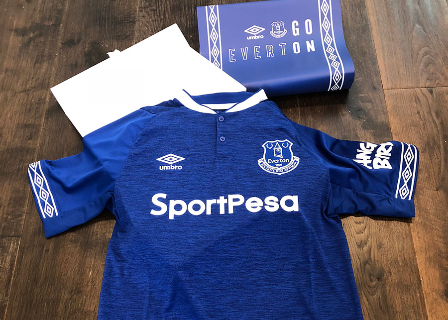
The phased unveiling of the new Everton strips always carries an air of trepidation. Under wraps for months as the manufacturers' designers draw up the look that our beloved team will wear for the season, they're then announced to supporters as a fait accompli to much fanfare in the spring.
It's not a simple undertaking. The commerce-driven need to release new kits every season means that it is incumbent on Umbro, in the case of the past few years, to come up with something each year that is sufficiently different from the last but one which remains faithful to the club's traditions while trying to please as many supporters as possible.
The bar — not to mention expectations — is high and they're never going to please everybody but, armed with the data from last year's survey of Evertonians on what they want to see from the Blues' home and change kits, the Umbro and the club have done a pretty good job of hitting close to the mark, particularly with recent home jerseys.
2016-17's iteration wasn't universally loved because of the yellow flashes on the sleeves and 2017-18's release was initially met with some reservations over the dark panels around the armpits but both were popular because of the predominance of royal — or “reflex” — blue to the overall look. But next season's edition has met with some of the strongest acclaim yet if the reaction on social media and fan sites is any indication.
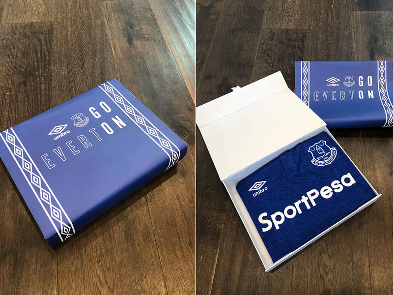
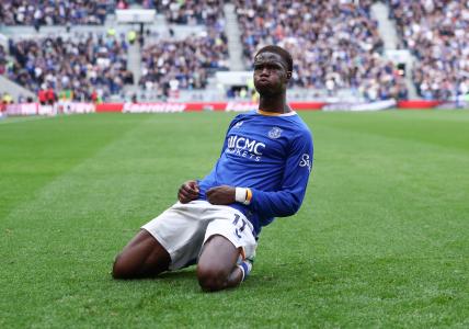
It's easy to see why, particularly when you see it in the flesh. It is classically Everton blue but instead of going with the same fabric to which we've all become accustomed on active wear throughout, Umbro have added a unique marl effect on all parts of the shirt except the sleeves. Viewed up close, it's actually complimentary to the new “camo” range Everton of leisurewear recently released which may or not be a coincidence.
The grandad collar (best worn with the top button undone so it doesn't look too much like a dog collar!), adds a partial nod to the jerseys from the glory days of the 1960s while the instantly recognisable Umbro diamonds make a return as a band around the sleeves. They come close to the line of the kit producer's branding taking over but as a design element it works, if only because it harks back so strongly to the days when Bob Latchford walked on water.
The reverse is plain apart from a Prince Rupert's Tower motif which replaces the Bill Dean silhouette and, of course, the players' name and number. The shorts are white, of course, and, pleasingly, so are the socks.
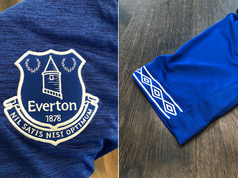
If there is a gripe it's the Angry Birds logo which detracts from what is a really attractive home jersey but, again, those commercial demands make for unavoidable compromises. It would be nice to have the option not to have the game's oversized logo but that doesn't appear to be possible and Rovio's insistence that it appear on all replica kits is almost certainly written into the sponsorship contract.
As far as the goalkeeper's jersey goes, it's a move away from the bright salmon pink number that Jordan Pickford wore for most of this season and a return to traditional green. Black has always looked the most attractive to these eyes but there's also the need to stand out and this mostly bright green number will do the job.
Overall, it looks as though the club have scored with the 2018-19 home strip and another one of those stirring promotional videos to go with it. Running under the slogan “Go On”, there is unmistakable undercurrent of progress in the video.
After such a forgettable season, you can't help but hope that with lines like “I'm telling you, there's going to be progress,” and “we're moving forward, restless, advancing, improving,” Everton are hinting at the big decisions that we all hope are coming this summer that could usher in change from top to bottom and in key areas in the team.
A brand new home kit won't change much — it's early availability is a welcome change, though, and shouldn't be overlooked as a sign of progress in itself — but if those big leaps forward are in the pipeline and improvement on the field is coming next season, the Boys in Blue are going to look damned good doing it!
The new Everton 2018/19 Home kit is available to order now for adults, juniors, infants and babies from EvertonDirect.com.
 Follow @EFCLyndon
Reader Comments (22)
Note: the following content is not moderated or vetted by the site owners at the time of submission. Comments are the responsibility of the poster. Disclaimer
2 Posted 07/05/2018 at 21:12:59
3 Posted 07/05/2018 at 21:26:57
4 Posted 07/05/2018 at 21:52:24
5 Posted 07/05/2018 at 22:07:29
A nice white away shirt would be nice now.
Pity the 3 shirts are not available for seasons end as I'm sure the club would score financially
6 Posted 07/05/2018 at 22:36:11
(Can't bear all those Manure and RS "fans" that buy the shirts but never the match tickets)
I like my retro ones (84, 66, 85) yet this one is okay. Might get it if I can find one without the sponsorship.
7 Posted 07/05/2018 at 23:29:31
Maybe we could see a new home shirt one year followed by the away shirt the following year with our latest the 3rd choice shirt being replaced every year!
8 Posted 07/05/2018 at 23:32:56
I've never seen the point of buying overpriced gear plastered with adverts.
9 Posted 08/05/2018 at 00:48:10
They'd sell a ton of them if they'd throw in those hard wood floors modeled in the pictures.
10 Posted 08/05/2018 at 01:20:17
11 Posted 08/05/2018 at 02:31:21
But I could be tempted. And I'm tempted to use some wundaweb style shit to put something over the angry birds logo. I couldn't care less if its not in keeping with the kit. This will do...
https://www.ebay.co.uk/itm/TEAM-HONEY-BADGER-MILITARY-TACTICAL-US-ARMY-ISAF-MORALE-COMBAT-ACU-VELCRO-PATCH/261567196882?epid=1431655267&hash=item3ce69eaed2:g:wHUAAOSwqu9VLVdd
12 Posted 08/05/2018 at 02:57:15
It all got too much for me when fans started wearing away kits at away games. Each to his own but I think they change the kit just enough to ensure we can't get away with not buying one every year.
13 Posted 08/05/2018 at 06:16:04
Not a big fan of modern kits as they don't cater/fit fat bastards such as myself!
14 Posted 08/05/2018 at 14:39:48
15 Posted 08/05/2018 at 16:35:54
Lyndon, I like the close up of the crest and the Latin, but whilst Sam Allardyce is manager it is taking the mick a wee bit.
What is Latin for “If we reinforce 8th is good enough?â€
16 Posted 08/05/2018 at 23:35:25
BTW – a seagull shat on my Everton hoodie this evening & I'm off to Chester Races tomorrow – is that a good sign?
17 Posted 08/05/2018 at 00:01:20
Says the man whose "Everton hoodie" he was wearing got shat on by a shitehawk lol.
18 Posted 09/05/2018 at 09:09:24
19 Posted 09/05/2018 at 09:27:16
21 Posted 09/05/2018 at 10:27:48
Maybe it was just an ‘angry bird'.
22 Posted 09/05/2018 at 21:41:31
23 Posted 09/05/2018 at 23:47:46
Anyhow I enjoyed Tony's comment and totally agree with John Davies; let's argue about shirts with or without collars, logos and 50 shades of blue so that the real issues to do with the mismanagement of our club get side lined.
Add Your Comments
In order to post a comment, you need to be logged in as a registered user of the site.
Or Sign up as a ToffeeWeb Member — it's free, takes just a few minutes and will allow you to post your comments on articles and Talking Points submissions across the site.
, placement: 'Below Article Thumbnails', target_type: 'mix' });
-sm.jpg)
-sm.jpg)
-sm.jpg)
-sm.jpg)



1 Posted 07/05/2018 at 21:09:11