


Season › 2013-14 › News
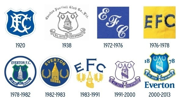
Everton begin crest consultation
Questionnaire launches today at evertonfc.com/crest
Everton launch the consultation process today that will give supporters the chance to help shape and select the new official crest.
From today, Evertonians can complete an online questionnaire to provide their thoughts on how they want the new crest to look and also apply to join one of a series of focus groups taking place at Goodison Park.
Plans for how the next crest will be designed and selected were announced last week with the extensive consultation process allowing every supporter the chance to have their say.
In what is a first for the club and a move that is illustrative of Everton's commitment to embracing feedback from its fanbase, supporters will also be able to choose the final design that will be used from the 2014/15 season onwards through an online vote.
Director of Communications Alan Myers, alongside the Club's Senior Executive Team will oversee the entire process with key independent support from Liverpool-based agency Kenyon Fraser.
There are various ways that supporters can get involved in helping to shape the new crest design. They are:
• Online — Supporters can complete a questionnaire at evertonfc.com/crest from today to provide their feedback on how they want the new crest to look and the importance of the individual elements from previous crests. There will also be an option for fans to upload their own designs or sketches.
• Focus groups — A series of focus groups will be set up with representative supporter groups such as Supporters' Clubs, Shareholders, the Fans' Forum, the new Junior Fans' Forum, the Everton Heritage Society and the Everton Former Players' Foundation. Supporters can also register an interest to join a focus group about the new crest at evertonfc.com/crest.
Evertonians will have the chance to submit feedback until Sunday 15 September. Independent of the Club, Kenyon Fraser will collate all the suggestions, ideas and feedback from supporters. They will review, interpret and then create design options for the fanbase to vote on.
Supporters will then have the power to make the final decision when the newly designed crests are presented alongside a detailed explanation of how each one has been developed.
Every Evertonian with a registered customer number, based on ticket purchasing or membership — an estimated 300,000 fans — will be asked to select their favourite design at evertonfc.com/crest.
The results of the vote will be revealed on Thursday 3 October and the new Club crest, shaped and chosen by Evertonians, will appear on all media, buildings, merchandise and, of course, the famous Royal Blue jersey from the 2014/15 season.
Myers said of the process: “I know the fans have been awaiting details of the process to choose the new crest and from listening to them it is clear that they have many ideas on what they want. We will consult with all Evertonians and the crest will be the fans' choice.
“The process allows fans to tell us what they want in their new crest so that a number of options can be created and they can select the best one.
“The 2014/15 crest will be the people's crest, make no mistake about that. All I ask is that the fans trust me, as an Evertonian, to deliver it to them. Every single supporter may not get exactly what they want but they will have the chance to give their input and shape the crest. We will do this together because ‘We are Everton',” he added.
Quotes or other material sourced from Everton FC
Reader Comments (65)
Note: the following content is not moderated or vetted by the site owners at the time of submission. Comments are the responsibility of the poster. Disclaimer
2 Posted 27/08/2013 at 06:36:57
3 Posted 27/08/2013 at 06:51:29
Or is that 300,000 over 1 year? 5 years? etc.?
4 Posted 27/08/2013 at 07:56:53
5 Posted 27/08/2013 at 08:08:40
I can only imagine they're doing it this way so non-Evertonians can't vote.
6 Posted 27/08/2013 at 08:29:33
Back in 2010(ish) Elston mentioned that we had had 90 000 people attending the match over the course of one season. That we now can refer to 300 000 is excellent news. Can we fill a 50-55 000 stadium with no restricted views? Probably.
7 Posted 27/08/2013 at 09:22:49
8 Posted 27/08/2013 at 09:45:09
9 Posted 27/08/2013 at 09:23:18
Personally I'm happy with the concept of the new badge, but the execution is sloppy, the shield is too fat bottomed and the tower is too cartoony giving it a distinct Fisher Price feel. Scale down the size of the name and tower and put 1878 within laurels and the only thing missing is the motto. This has only featured on four of the clubs ten badges and whatever happens it will remain the clubs motto. If this is the one compromise we have to make for a modernized badge that fans can accept and the club can use in its commercial plans then surely we have to go with that.
10 Posted 27/08/2013 at 10:00:30
If they redesign the tower, get rid of 'Everton' from the shield (EFC would suffice) and add the motto then I'd be happy.
11 Posted 27/08/2013 at 10:01:01
12 Posted 27/08/2013 at 10:08:01
13 Posted 27/08/2013 at 10:18:17
There was some fantastic ones there - seem to remember a couple that were real class.
14 Posted 27/08/2013 at 10:15:54
What surprised and pained me somewhat was that, after careful consideration, two of my three favourite badges belonged to West 'Aaaam and Spurs.
15 Posted 27/08/2013 at 10:23:18
Especially the top one in Lyndon's post at 957, something like that would be ideal. Even something like the Everton version of Arsenal's badge at 881 isn't bad.
16 Posted 27/08/2013 at 10:24:12
Could do this as many time as you want I suppose and doesn't stop dickheads filling out stupid ones.
17 Posted 27/08/2013 at 10:35:42
18 Posted 27/08/2013 at 10:32:53
They would get a pretty good idea of what the real fans are thinking and it would demonstrate to the Club that we are more than a bunch of moan arses.
Pity they didn't think of this a year ago
19 Posted 27/08/2013 at 10:35:31
20 Posted 27/08/2013 at 10:59:53
21 Posted 27/08/2013 at 10:36:52
One being that apart from West Ham's badge, I thought the others were shite and didn't have a 'third favourite'.
I put West Ham, Huddersfield and Burnley - NOT because I think they're great crests, but because they're the least not 'modern and my feeling is our board would basically love an Everton version of a McDonald's logo and to be able to say "You chose it!"
As for the logos bit, that scared me most.
They're logos ffs, I don't HAVE 'a favourite' (or a second or third favourite) and there wasn't the facility to say 'hate them all' and move on.
The further I went through it, the more uncomfortable I felt and I'll say it now - I think the format has been set up in such a way the skew things a certain way.
It reminded me of them trying to choose the colour to paint their hut in Auf Wiedersehen Pet.
They all choose a different colour for first and second choice, but for third choice, 2 of them choose pink.
When pink is announced as the winner Dennis says "So everyone gets what nobody wants?"
Neville (who devised the scheme) responds lamely "Well...that's democracy man".
The 22,500 who voted with their online protests were disgusted that 1) The new crest was an abomination that looked like a (Fisher Price) logo and 2) That the history (ie: latin) had been chucked in the bin.
All that's needed is the right brief, a few new designs by professionals and a vote on a favourite.
I hope I'm dead wrong but nobody can say I'm not justified in being nervous, or in not trusting our board to do the right thing.
22 Posted 27/08/2013 at 11:17:43
I almost stopped at that point.
They've set it up so that they get a simple, modern design as close to the one they already have, or in fact... the one that they already have.
I share this nervousness.
23 Posted 27/08/2013 at 11:16:57
Some people would like to keep the previous badge, maybe with some tweaks. Some people would like a more radical change. Many think it's crucial that certain elements of the design are retained - the NSNO, or the wreaths, or the 1878, or the club name - but we don't agree on which.
Personally, I'd be fine with a very simplified design, just with the tower (not the ugly new one) surrounded by large wreaths, and EFC or Everton FC underneath. Like the one in comment 957 in this thread (forgot to add it in my last post!): http://www.toffeeweb.com/season/12-13/news/24760.html
But I know that a lot of people would like a more traditional shield-type design, think it's crucial that the NSNO banner is there, etc.
Maybe in the end, if the quality of the design is good (unlike this year's one) then any of these ideas could work.
24 Posted 27/08/2013 at 11:29:54
Maybe tidy up the laurels too.
For me that would be just about perfect
25 Posted 27/08/2013 at 11:41:42
It is easy to remember, it is clean and fresh and it has got nice colours.
What would you have said if we went back to the seventies logos? The last time we won the league we had a pretty ugly logo.
26 Posted 27/08/2013 at 11:47:07
Bloody first past the post. Whatever happened to the alternative voting system?!
27 Posted 27/08/2013 at 11:56:04
28 Posted 27/08/2013 at 11:52:43
29 Posted 27/08/2013 at 12:08:16
30 Posted 27/08/2013 at 12:07:52
32 Posted 27/08/2013 at 12:14:57
Dilapidated stadium with little ability to allow us to maximise our revenues (which would support team building)? Couldn't give a shite, as long as we play a bit.
I can sort of see why they went for the logo they went with - it does fit with the "globalisation" of the game, were history, and tradition and especially latin don't count for shit with the fans in Asia wearing Man City shirts (who 2 years ago had a Chelsea shirt, and 4 years ago had an Arsenal shirt). But the way they went about it was, well, unsurprisingly typical.
I wonder how this announcement will go down well in the US, where NBC - themselves rebranding to NBCSN, have plastered our logo all over the place (trains, taxis etc!)
33 Posted 27/08/2013 at 12:26:52
I'm definitely with Eugene on this, West Ham was my first choice too, I struggled after that one and ended up going with QPR.
It does seem that the questions are very leading, I fear they are leading the answers to simplicity, not to what it represents
34 Posted 27/08/2013 at 12:25:38
Kenwright is like a combination of a North Korean dictator and the roman emperor who fiddled whilst Rome burned!
As Matt says who cares about a new crest when there are far more important issues.
The man is a disgrace
35 Posted 27/08/2013 at 12:25:30
36 Posted 27/08/2013 at 12:30:08
37 Posted 27/08/2013 at 12:32:45
38 Posted 27/08/2013 at 12:39:37
39 Posted 27/08/2013 at 12:54:42
We can voice our displeasure with the board but ultimately it means nothing.
40 Posted 27/08/2013 at 12:59:32
This could mean so many different things, visually and be open to 'intended misinterpretation' which the club can happily post rationalise with carefully selected comments from fans.
Personally, I don't want us to look old fashioned but I still want us to look like a traditional football club not a ' franchise or brand' - particularly unhappy to see McDonald's logos and the like even referenced!.
It's easy to say which 'elements' we want retained but gathering them together in a striking, cohesive whole is a job for professionals - I fear the 'vote for your favourite' strategy may end with a 'committee built camel'.
Also, as a creative who's seen this happen many times, I'm very concerned that they'll give weeks to the questionnaire and consultation stage and then the designers will get just a week to put 'something stunning' together.
It's vital that the final execution is put together by someone not only with a clear vision but also the required level of skill and expertise, not the chancers who put the 'Fisher Price' version together.
Fingers crossed but apprehensive.
41 Posted 27/08/2013 at 13:15:27
Like I said, it's not 300,000 fans per season. It's 300,000 customer numbers that have been assigned since their introduction in 2008 (or around then).
I don't think anyone is saying that the badge is more important than the long term future of the club. However it's release brought about thousands of complaints so obviously people do care. We want the badge to suit the club and it doesn't have to be a massively expensive process. If the club hadnt got it so monumentally wrong first time around them all this wouldn't be necessary.
Those protesting the badge should be praised for actually making a difference. If there was a similarly large-scale protest against the board then perhaps it might be reported that 'Our Leader' isn't all he's cracked up to be.
42 Posted 27/08/2013 at 13:08:36
Of COURSE there are more important issues than the badge/crest, but that is what THIS thread is about.
If you want a thread along the lines "Kenwright is an egotistical, spoofing shit-bag snake-oil salesman and his board are a bunch of self-serving slippery fuck-witted con-men" - then have a look at some of the other letters/columns/articles on TW, or better still, start one yourself.
(although maybe change that title as I've used it before)
And please, no more 'move on', it means nothing unless specifying to what or to where and makes you (anyone!) sound like a some bent politician on Question Time whose argument is falling to pieces - "Look, these are not the important issues, we need to forget I was caught fiddling my expenses and nobbing two hookers while snorting beak off their tits and....move on".
It's like a 6 year-old saying "Stop talking about what YOU want to talk about and talk about what I want to talk about!" (to which my personal response would always be, 'get fucked you little cun..!')
43 Posted 27/08/2013 at 13:26:41
Bill: "Never mind that, let the soft bastards pick the new badge for next year, that'll shut them up for a while. Have you sorted the bouncy castle & march for Roberto yet?"
44 Posted 27/08/2013 at 14:34:58
Having shot themselves in the foot with the image re-branding, like all organisations conscious of their external image they have tried to take the negative and turn it to a positive – asking the very fans who complained to contribute. This activity, where properly done represents the perfect opportunity to ask the fans only the questions you want to ask, and to elicit only the answers you want – thus asking your fanbase to validate the decisions you have already made!
A quick look at the questionnaire on the EFC website suggests to me that this is what EFC have done - and although I disagree with this as a valid process, I find myself actually admiring the fact that it has been done well. We are being asked to order our priorities for the elements of a crest – allowing EFC to justifiably say that '90% of you indicated that the motto was the least important part...' We are further being asked to identify with a non-EFC logo, and they have chosen the logos very well indeed, selecting shiny, modern, simple logos and comparing them to complicated and ugly logos.
All in all, we are being led by the hand to confirm that a new crest should be simple and should not contain all those complicated bits that have already been removed. Like I said, for once it is well done to the EFC marketing team...
Except...
Have you tried to see how many times you can contribute? Have you checked to see if you need to be logged in to the EFC website to complete the survey?
This survey – ostensibly for Everton Fans to complete, can be completed by anybody, and as many times as they like. There are no checks, no need to log in, no captcha to stop bots from reporting answers.
At whom therefore is this survey aimed? Are Everton aiming at EFC fans or at anyone who has an internet connection and 2 minutes to spare?
Please Everton, try to do something wholly right – if anyone can complete this survey and as many times as they like, what fucking good is it?
45 Posted 27/08/2013 at 14:51:18
The crest has always basically been the one portrayed as 1938. Sometimes it's been portrayed on the shirt, sometimes it hasn't.
Just keep the Club crest as the original ( the 1991-2000 shirt badge basically ) and design a new badge for the shirt. Funnily enough, the shirt badge I like is the one that only lasted for one season, 30 years ago, designed by Umbro and replaced by Le Coq's version when we changed kit supplier in 1983.
Like the Kirkby vote, the wording of the questions can easily skew the survey. So, yes I am a bit nervous about how this will end up.
46 Posted 27/08/2013 at 16:36:35
47 Posted 27/08/2013 at 16:23:22
Exactly and believe me, EVERY word will have been considered and debated.
Basically it's sleight-of-hand.
I mean imagine if I wanted the badge to be (more or less) as it was and I put forward the following survey - it would, on the face of it, just be asking for your preferences.
Nevertheless it is DEFINITELY skewed to obtain the result I want.
Do you think the historical latin motto is A) Important to show our heritage, or B) Old fashioned?
Do you prefer A) The traditional Everton laurels, or B) No laurels?
Would you like to A) Keep the design of tower as it has remained virtually unchanged since 1938, or B) A new modern shape?
Here are some logo's (same logos). Do you find them A) Cold, corporate, associated with greed, or B) Great, love them.
Etc etc.
48 Posted 27/08/2013 at 16:54:32
Totally agree Colin.
Where's the £24M TV money Kenwright?
49 Posted 27/08/2013 at 16:56:24
Hey ho - I suppose by now we should expect better.
50 Posted 27/08/2013 at 17:04:20
What a surprise.
As someone said above, now (or in a year) would be a really bad time to change things, especially given that we're plastered all over the US and our presence there appears to be a huge part of the PR push.
Oh well, at least we're playing sparkling football and winning games...
51 Posted 27/08/2013 at 17:12:04
The club wants a corporate logo.
We want a football club's badge.
These are not the same thing.
52 Posted 27/08/2013 at 17:53:15
53 Posted 27/08/2013 at 16:52:04
Does the shirt badge have to be an exact replica? I was very fond of the crest which has recently been replaced but never liked it on the shirt.
54 Posted 27/08/2013 at 18:04:41
Kim Jong Nero Bill! Throw Caligula in the mix. He thought he was loved by everyone as well.
55 Posted 27/08/2013 at 18:03:14
In our case, I hope it isn't just a 'bread and circuses' distraction, while Bill sells Fellaini and shovels most of the proceeds into our financial black hole.
As an aside, I agree with other posters that a badge and a logo are not the same thing. Nor did I think the survey was especially helpful in asking for opinions on logos not even remotely connected to the task in hand. Everton are a founder member of the league so history and heritage is a major strength. That would not be at all the case for brands like Apple or Nike, whose logos are excellent, but irrelevant to our position.
56 Posted 27/08/2013 at 18:52:59
It needs to evoke Everton for Evertonians and for our opponents too
And though I always enjoy and respect the overwhelming majority of what Harold says (and take into account his professional eye as an artist), I don't agree with a shirt badge being different to the club crest, for me they are identical
A merchandising badge ? Fine, that I do agree with and in fact think that the 1920 Crest is almost perfect in that regard because it is much more versatile, and although the merchandise is official surely it is not in the same league as the treasured "Royal Blue Jersey" ?
57 Posted 27/08/2013 at 21:14:10
58 Posted 27/08/2013 at 22:16:42
There’s a definite feel of “rigged” about it to me. Why?
As I went through the questionnaire I had the unnerving feeling that my answers were on paper voting for the “new crest”, but I don’t like the “new crest” so how does that work….?
I went for Wolves and VW for their “Simplicity”, “Instantly Recognisability” and something else I cant remember – all of which I could see a marketing executive grinning and saying to me “See, that’s what we’ve done with the new crest, can you see it now….? We were right all along…thank you for eventually agreeing with us….don’t worry, it was just a reaction to change….you’ll get used to it and like much more than the last crest once you do….trust us…”
It feels like the design agency have had a right kick in the nuts from the backlash, the club have said to them “earn your fee and sort it” and they’ve gone “right we’re going to have to spell it out to this lot Janet and John style…..but lets be right, this is Round 2 and we’re going to bill you again Bill…our expertise doesn’t come for free…”
I’m no graphic designer / marketing guru but the biggest reason I’m uncomfortable with it is the timescales set by the club.
The process starts today, consultation ending in roughly 3 weeks.
A week after that the designs are announced ready for the vote, which lasts a week.
Two days later the new crest is revealed.
All seems very quick to me, as if in the background the options are already set, just a few things can be added here and there depending on our answers if they fit into what the club are looking for.
I think we will inevitably be voting for one of a number of crest in just over a month, already pretty much determine now, none of which really meet what anyone wants and none of which we can object to to the same extent as the last offering because a) we were consulted and b) 8 out of 10 respondents said at this point of the questionnaire that……they wanted simplicity….
I just want them to get it right, and though I enjoyed doing the exercise, I decidedly felt that I was being “played”. Roll on 23rd September and we’ll see what they put on the table……
Damned if they do, damned if they don’t, but if they put 6 abominations on the table we shouldn’t settle for the “least worst”.
By definition – only the best will do.
59 Posted 27/08/2013 at 22:55:37
60 Posted 27/08/2013 at 23:37:18
I went for Arsenal.
61 Posted 28/08/2013 at 02:37:34
62 Posted 28/08/2013 at 02:23:35
They start with all the right questions regarding the heritage of the club and what is important to us... only to then skew the final collection of questions towards logos that have "simplicity" and are "instantly recognisable" like the Nike swoosh.
"After consulting 300,000 Evertonians, via a series of very leading questions, we can only conclude that the type of logo they really want, is the one that we've just nailed to the main stand."
63 Posted 28/08/2013 at 07:17:43
64 Posted 28/08/2013 at 17:14:33
My training and experience in this field would not go down too well with the majority of fans because my first venture into the design world taught me to never give anyone a choice. Not even the choice of two. It leads to chaos.
However, the new Everton crest was a different scenario because the people most effected ..ie..the fans, did not request it. Some "not very wise" person took a chance and it backfired.
Eugene, Mike, Jamie and co are right of course. Apart from the dodgy questionnaire, there are persuasive snippets and photos all over the place. It's their job. It's what they do.
Personally, whatever the outcome, I will be supporting the most popular crest.
65 Posted 29/08/2013 at 06:10:51
66 Posted 29/08/2013 at 06:49:00
Add Your Comments
In order to post a comment, you need to be logged in as a registered user of the site.
Or Sign up as a ToffeeWeb Member — it's free, takes just a few minutes and will allow you to post your comments on articles and Talking Points submissions across the site.
1 Posted 27/08/2013 at 06:02:08
Where do they get the 300,000 fans from?
Where's the questionnaire? It's not at the link provided above?