


Season › 2013-14 › News
Three new crest options revealed
Voting opens at noon on Monday
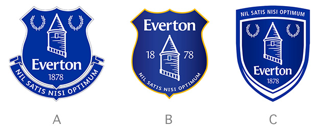
The choices selected for the new Everton badge have been posted on Twitter by the club.
They feature a strong blue impression throughout — with only a feint hint of yellow on the middle of the three... which is most like the current version.
All feature the four prime components: Tower, Motto, 'Everton' and 1878.
The early consensus is that the rendition of the Prince Rupert's Tower is certainly more appealing than the dreadful 'beehive' that is front and centre on the current, unpopular badge that brought the latest redesign about.
Voting begins at evertonfc.com/crestvote tomorrow (Monday) at noon but we're polling our readers as well to see if there is a different consensus here.
Quotes or other material sourced from Everton FC
Reader Comments (326)
Note: the following content is not moderated or vetted by the site owners at the time of submission. Comments are the responsibility of the poster. Disclaimer
2 Posted 22/09/2013 at 22:13:59
Oldie looking but modern and no shitty yellow in it
3 Posted 22/09/2013 at 22:14:46
4 Posted 22/09/2013 at 22:15:14
5 Posted 22/09/2013 at 22:12:35
I doubt whether we will get a vote on TW, or will we?
6 Posted 22/09/2013 at 22:16:09
7 Posted 22/09/2013 at 22:16:41
8 Posted 22/09/2013 at 22:16:34
I like the one on the left. I'm one who values the 'shield' but the one on the right is nice in its own way too.
The middle one isn't my cup of tea.
LEFT LEFT LEFT
9 Posted 22/09/2013 at 22:18:10
10 Posted 22/09/2013 at 22:17:16
11 Posted 22/09/2013 at 22:19:23
12 Posted 22/09/2013 at 22:18:26
13 Posted 22/09/2013 at 22:18:31
If you go with the left one, how different is that really from the previous version? Personally I think it's inferior. Doesn't the scroll underneath make it too hard to reproduce???
14 Posted 22/09/2013 at 22:20:16
With that said, Number 3 (right) is probably the best looking but it's not Everton. Therefore I'm going to plump for Number 1 (left.)
15 Posted 22/09/2013 at 22:17:05
I don't understand how our badge last season could be deemed digital unfriendly (or whatever it was) and the one on the left isn't. It has everything in it that the old one had. Should have kept last seasons.
16 Posted 22/09/2013 at 22:21:39
17 Posted 22/09/2013 at 22:25:18
18 Posted 22/09/2013 at 22:26:49
19 Posted 22/09/2013 at 22:27:26
20 Posted 22/09/2013 at 22:19:57
I think the middle one will magically get chosen because it looks the most likely to be rotating around on the background of Monday Night football although it is crucially missing the laurel wreaths (again I can't imagine anyone voted for their omission from any new crest).
I think the one on the right is actually the best layout of all its components although the bottom of the border is a bit strange. I don't think this fits the brief of what the club want though, it doesn't look that easy to reproduce without error so I don't know why they've fit it in really.
The one on the left would be perfect if it didn't have Everton rammed into it. Then again it would just be the old badge and what would be the need for a consultation process. #1 gets my vote but I wouldn't be crushed by three. I can't stomach an Everton crest without the laurels on it though — although I'm sure the current board can quite easily.
21 Posted 22/09/2013 at 22:27:41
22 Posted 22/09/2013 at 22:27:39
23 Posted 22/09/2013 at 22:25:40
24 Posted 22/09/2013 at 22:28:41
Fuck, get a life, Stephens.
25 Posted 22/09/2013 at 22:29:07
I think something better could definitely be created...
26 Posted 22/09/2013 at 22:31:45
27 Posted 22/09/2013 at 22:32:44
28 Posted 22/09/2013 at 22:31:40
'Everton' does need to be on there, for the overseas millions who have no fucking idea who we are or where we are from. They are the new demographic I'm sure being targeted here — not the Old Guard from L4 and neighbouring burbs.
Mind you, since they have allowed a lock to be placed on the sale of our shirts, I'm not sure I really get the point of all this, TBH.
29 Posted 22/09/2013 at 22:31:41
The other two aren't as visually impressive and, like I said before, I think they deliberately included some off-putting features that would stop what would be an easy selection of a decent layout of either of those forms. Number 2 has Everton board written all over it and I will be shocked if that doesn't get selected regardless of the outcome of the vote.
30 Posted 22/09/2013 at 22:36:12
31 Posted 22/09/2013 at 22:33:18
What might help everyone choose better would be if they put these badge designs on (a) a blue shirt background or (b) yellow shirt or (c) on a white shirt...just a thought
32 Posted 22/09/2013 at 22:32:29
33 Posted 22/09/2013 at 22:21:10
34 Posted 22/09/2013 at 22:30:01
As for choosing one of them...um...the one on the left is the least shite.
(the MilkyOne on TW makes them ALL look like they were designed by a particularly unartistic potato).
35 Posted 22/09/2013 at 22:38:23
36 Posted 22/09/2013 at 22:40:20
37 Posted 22/09/2013 at 22:33:30
It's been a farce, and Kenyon Fraser are not the right people to be designing these. Neither was a solitary inhouse designer (even though he done a real redesign) it should have went to a massive design company with a proper brief.
38 Posted 22/09/2013 at 22:41:53
As they all have the same elements of the badge we had last season, why bother changing from that badge?
They are all improvements on the current badge (the fridge magnet as I call it) - but let's face it, that wouldn't be difficult.
Stop buggering about and go back to last season's badge.
39 Posted 22/09/2013 at 22:46:56
40 Posted 22/09/2013 at 22:40:52
The one on the left looks pretty much the same as the old one.
I like the one on the right and because of it's simple shape it would transfer well.
I can however see us voting in a crest that either :
A: is the same (pretty mush) as the old one (what a waste of time and money this all was!)
B: voting in a crest that is worse than the one that the vote was arranged for in the first place.
41 Posted 22/09/2013 at 22:45:46
I've walked down the length of the Bullens Road many times and the badge there is miles better than any of these toytown badges
42 Posted 22/09/2013 at 22:45:51
43 Posted 22/09/2013 at 22:35:43
Regardless, the tower and the laurels are key and cannot be missing. Please vote crest (1) left - and hopefully when overseas broadcasting collapses we can simply remove the awkward insertion of Everton and 1878. We know who we are, we know who we are....fuck off back to art school, we know who we are.
44 Posted 22/09/2013 at 22:48:08
45 Posted 22/09/2013 at 22:35:34
Middle one is a compromise blend of the old badge and the new one. All you can say for it is that its better than the current mess.
Left one doesnt fit the brief for ease of reproduction.
Right one doesnt fit at all.
I'd buy shirts with the left crest on.
46 Posted 22/09/2013 at 22:53:19
47 Posted 22/09/2013 at 22:51:32
Number 3 looks medieval to me, like it could be on a knight's armour !!!
Number 2 smacks too much of the current fridge magnet "effort".
48 Posted 22/09/2013 at 22:56:56
49 Posted 22/09/2013 at 22:52:25
50 Posted 22/09/2013 at 22:57:29
These are simply not good enough.
End of!
51 Posted 22/09/2013 at 22:49:30
I think the one on the left is the best because it is closest to the one we wanted to keep and features all the elements most fans are bound to say they wanted in response to the consultation. It is blue and white for the 'boys in the royal blue jersey' plus the tower is the traditional shape which is what we all wanted.
Amber or gold is not an overwhelming part of our tradition so that rules out the middle one for me.
The right hand one is, perhaps, futuristic and is intriguing but it would be a bold step. I would pick that one second.
52 Posted 22/09/2013 at 23:04:37
VOTE NO! BOYCOTT THE CREST VOTE!!!
53 Posted 22/09/2013 at 23:00:44
54 Posted 22/09/2013 at 23:07:30
I voted for number 1 under duress.
55 Posted 22/09/2013 at 22:57:40
BUT - it's just a revamped version of the old crest, not a particularly improved one.
When the shit hits the fan and they outlined a six week turnaround it was obvious this was bollocks and there wouldn't be something great. I hoped there would - but hey, I like A more than the current abomination mainly because it has the wreaths on it, which I feel are second only to the tower.
'Everton' doesn't have to be anywhere near the badge - I've never seen 'Christian' written under a cross.
Win and they will come, and if they don't - fuck 'em.
56 Posted 22/09/2013 at 23:07:38
Ok, some they are set on Everton being in the badge, why not put Everton above the tower like in the middle one, keep the winners Laurel Wreaths, and just sack off the "1878". so foreigners don't know who Everton are from just looking at the badge, but would the same guys really give a shit we were founded (not as Everton I might add) in 1878?
I'd also like the motto's colours to be inverted - a white scroll with blue writing.
57 Posted 22/09/2013 at 23:17:46
58 Posted 22/09/2013 at 23:21:11
59 Posted 22/09/2013 at 23:16:26
Very much like the old badge retro and a bit of modernization.
60 Posted 22/09/2013 at 23:11:50
That this is the sum total of a team of designers' work, with fan input, is truly appalling. How much do these people get paid? I think I could design a better crest by squatting over a piece of paper and wiggling whilst clenching a pencil between my arse cheeks.
What may I ask was wrong with the crest we have used these past 10 years or so? It kept our heritage but looked fresh and contemporary (and yes I think it is important to have our name on the crest for international audiences). The club have yet to actually explain what they mean when they say that the crest is hard to reproduce in the digital age. I'm sorry, but if in the last 25 years computer design has been able to create photo-realistic dinosaurs, level cities and create alien worlds full of giant smurfs, then I fail to see how trying to photocopy a shield and a banner is going to cause Microsoft to implode!
The options are appalling - the first looks like some horrendous throwback to the 80s, the second like a toddler has reconfigured the components of the old crest randomly using his set of fuzzy felts and the third - well this one looks the most like the crest of a 21st century football club, but absolutely NOT what an Everton crest should look like.
I said that I would never buy an Everton product with the new crest on it and have stuck by it despite the fact I love the new third kit (which is let down by the crest). Now I think I will not be buying an Everton product for the next decade or so.
Sad times.
61 Posted 22/09/2013 at 23:21:14
62 Posted 22/09/2013 at 23:15:03
PS: Crest A please (the one on the left!).
63 Posted 22/09/2013 at 23:14:42
If I was allowed to choose it, it would defnitely be http://www.bluekipper.com/articleimages/1370279577-Emilkyonedesign.jpg
As for 'Alan Corken' - "I like the current badge, it reflects our new confident approach. These are old school - like Moyes. Let's move forward!"
Fuck off Bill.
64 Posted 22/09/2013 at 23:25:12
65 Posted 22/09/2013 at 23:25:16
How can you have a choice of three bloody awful badges; and say you have got a favourite, because you've chosen the least pathetic?
66 Posted 22/09/2013 at 23:19:01
Interesting that B is the one that has the hint if yellow, the fading in the shield etc.
If it turns out we get B I will personally get the train into London and burn down the ERS.
Actually....that was a bit rash........nope! Checked again - I will burn down the ERS!
Also - the shield on C with the white tip and squeezed in motto on the top. I will stick a knife between my ribs to refer pain to a different area to cope with this if it gets voted in - I think it's called self harm.
Also - do you think the designers spent a lot of time and admittedly came up with a we'll designed, modern, multi functional platform blah blah marketing solution which we completely rejected, the clubs said you've got to do something different and they've said it'll cost you so with the crumbs of budget left the WANKERS have given us three fairly wank options.
About as creative as my next post. But I don't get paid for this shit.
67 Posted 22/09/2013 at 23:29:19
68 Posted 22/09/2013 at 23:24:40
69 Posted 22/09/2013 at 23:31:01
70 Posted 22/09/2013 at 23:36:35
They are all better than the current one. The last one was rubbish anyway after Bill had it revamped in 2000 with that pale blue with 18 and 78 floating around it and Everton just stuck underneath it. He ruined the proper crest, which has only been on the shirt twice 1978-1982 and 1991-2000.
So stop crying Michael, the proper crest got binned 13 years ago. Boycott the vote? You wonder why ToffeeWeb gets the negative tag?
B is horrible, too much like this season's abomination.
C is better than B, but don't like that shield, especially the lines drifting apart at the bottom. What's that all about.
You can't please everybody, but they have tried and I will be perfectly happy with A.
71 Posted 22/09/2013 at 23:38:08
I genuinely think it's bollocks having 'Everton' on there. Isn't one of our sayings 'Needs no explanation'?
La Coste don't have "The Crocodile", no national flag has the name of the country underneath it (a pedant will prove me wrong) and no stamp says 'Royal Mail' on it.
We have an iconic crest, it needs no explanation and If we win games wearing it we won't be introduced on tele as 'the team with the badge with the tower and leaves on it' - we'll be introduced as EVERTON and any half wit will make the connection and if they don't thank fuck they don't support us!
72 Posted 22/09/2013 at 23:45:32
We are, in my humble opinion, being offered a choice of three pathetic creations, of which one will represent our club! Dearie me. I wonder at times why some think it's being negastive to say that none of them are worth putting on a shirt of EFC.
73 Posted 22/09/2013 at 23:52:25
74 Posted 22/09/2013 at 23:52:34
Your opinion is that they are all pathetic. That is clearly a negative opinion.
75 Posted 22/09/2013 at 23:57:29
Whoever had a hand in designing them should be sacked immediately - and it maybe a good idea to get a new career.
78 Posted 22/09/2013 at 23:43:29
I presume Everton will have had to apply for copyright on all three. Or have they already applied for the copyright on ONLY one of these piles of shite.
Just a thought.
79 Posted 22/09/2013 at 23:49:30
Why the boring Everton font?
Why no non-shield options?
Why no imaginative variations?
Seems a complete waste of time. There were much better options produced by the fans. Even Lyndon's effort beat these.
80 Posted 22/09/2013 at 23:59:12
81 Posted 23/09/2013 at 00:01:42
82 Posted 22/09/2013 at 23:55:54
Last year I was on holiday in Spain and bought a ball to play on the beach with my lad - who at the time was 5.
It was smaller than a standard football, was just the right size for a kick about, was made up of the Barcelona colours and had the Barcelona crest on it.
My lad loved it to bits, pointed at the crest and said 'what's does that mean'? I explained it was Barcelona Football Team and he's six now, loves them to bits, has absolutely no idea how good they are but he's 'chosen' them as a team he likes.
If a 5 year old can do it, anyone can.
83 Posted 22/09/2013 at 23:51:00
The problem with the redesign was the dumping of the wreaths and the ugly tower design. Fix them two and we would have been ok.
Now we're just in farcical territory. I know, I work with designers every day.
84 Posted 23/09/2013 at 00:03:29
It's bloody obvious we have different opinions, which of course is the way of the world. I don't think the word pathetic has ever been used as a positive though.
We all want what's best don't we? So let's not fall out, eh?
85 Posted 22/09/2013 at 23:56:31
Sometimes change is good... and I like the current one now anyways even though I'll get slaughtered for saying it.
86 Posted 23/09/2013 at 00:10:48
87 Posted 23/09/2013 at 00:08:27
Aye we all want what's best but I don't think any of these live up to our motto.
88 Posted 23/09/2013 at 00:09:34
You may think that, but clearly it's not the case.
Anyone voting for these who thinks a better job could be done is obviously settling for "not what's best" — aka something 'pathetic', at least in the context of what COULD be achieved.
Ironically (or not) it's exactly the same argument we had between those who accepted OFM and what he was doing to our club as 'good enough' because we didn't deserve / couldn't afford anything better. And guess what: people like you, Karl Masters, were very quick to label them as "negative" — because they wanted something better.
True Colours...
89 Posted 23/09/2013 at 00:08:05
The best designed is number 3, on the right. It doesn't make me want to leap up and down with glee, but such is life...
90 Posted 23/09/2013 at 00:11:21
Of the three, Option A is perhaps most acceptable but the scroll below the shield looks a bit fussy and the entire design is a bit busy. I think someone else mentioned that it would be useful to see mock ups of how these designs would look on the shirt.
I voted for the change to the circular badge as I was really impressed with some of the fans designs. Surprised that not one circular design made it to the last three for consideration.
91 Posted 22/09/2013 at 23:54:13
First three would be the "new" options,
#4 would be the badge before "the abomination"
#5 would be "none of options #1>#4"
and
Option #6 would be "Fuck off Kenwright"
Just a thought
92 Posted 23/09/2013 at 00:19:14
93 Posted 23/09/2013 at 00:21:19
The bit where I said " of which we could select two" LOL
And Yes that's what I'd vote too Jim !
94 Posted 23/09/2013 at 00:19:30
A looks like a bad version of the old one, and B just looks silly.
C for me.
95 Posted 23/09/2013 at 00:26:35
96 Posted 23/09/2013 at 00:34:22
97 Posted 23/09/2013 at 00:39:00
98 Posted 23/09/2013 at 00:28:08
The choices reinstate the motto due to fans' complaints - OK
BUT..
for fuck's sake, the only reason we have the 2 fat badges is to include the name Everton
I refer the forum and the tossers at the Everton "commercial" dept to Harry Catterick's 60's statement "we don't need our name on our shirts; everyone knows the team in Royal Blue is Everton"
It's simply a marketing ploy to make the sweat-shop, Asian production easier so our "partners" can make greater profits
Note the complexity of some other PL badges
As well as the worth-consideration, non-My Little Pony badges designed and offered by "ordinary" Evertonians, what in God's name is wrong with the 1991 badge?
http://www.historicalkits.co.uk/Everton/Everton.htm
I like the 3rd strip worn at West Ham but will not buy anything sullied with that abomination (collectors' item?)
I give up; this club is hard going, a lot of the time
99 Posted 23/09/2013 at 00:49:02
Though I really don't see how it fits the original brief of needing a modern, scalable crest - I've never seen so many individual design elements crammed into such a small space.
The problem is trying to design anything by committee isn't going to work. Even though I'm not a fan of the crest we're using this season, I honestly wish they had the gumption to just stick with it - everyone would get over it sooner or later.
All this does is drag the issue out and still we'll never please everyone.
100 Posted 23/09/2013 at 00:51:30
A - knocked up Everton Badge
B - pppphhh!!!!
C - am I on cam
101 Posted 23/09/2013 at 01:10:37
Speak for yourself
102 Posted 23/09/2013 at 01:15:57
My vote: Lyndon's
Of the three available, A.
105 Posted 23/09/2013 at 01:52:30
A conservative, historical knee-jerk that is actually a lot worse than it's predecessor.
I Should have voted for B:
Clean, modern, Nil satis,Tower, Shield (Date) in an enclosed space...
No Laurels; however, I really liked the round badge #5/#6 on the previous crest post as it had everything but may have been deemed to Chelsea?
IRMWT.
107 Posted 23/09/2013 at 01:52:21
I was wrong.
Are they better than "the abomination'? Clearly yes they are. Well done.
Are they better than the one before that? Not particularly.
I understand that the message from fans was not to break too far from tradition. A and B meet that criteria, but they are just so uninspiring.
I hope we didn't pay a lot to the people who came up with these because I have seen at least three designs from fans which shit all over these.
I think A is the best of a disappointingly mediocre bunch.
108 Posted 23/09/2013 at 03:35:11
109 Posted 23/09/2013 at 03:53:40
For such a stink about the changing of the badge, I feel it's a pretty poor attempt from the club to update the badge (again). Unfortunately the club will turn around and say 'We asked your opinion, and you gave it, and this is what you wanted."
110 Posted 23/09/2013 at 04:15:25
Bloody hell. What a choice. We have to pick a badge we don't like just because its not as bad as the others. All our crap so disappointing
111 Posted 23/09/2013 at 04:56:12
Some will like it. Some won't. Its easy to agree we don't like something.
But you could put up a million different designs and have the vast majority of fans hating each one of them.
112 Posted 23/09/2013 at 05:04:47
113 Posted 23/09/2013 at 05:17:40
115 Posted 23/09/2013 at 06:22:42
116 Posted 23/09/2013 at 06:43:03
117 Posted 23/09/2013 at 06:58:42
118 Posted 23/09/2013 at 07:08:16
119 Posted 23/09/2013 at 07:26:32
120 Posted 23/09/2013 at 07:54:49
You can't do this by committee as its too many voices but I applaud the club for listening. We got the procedure we wanted so we can't complain too much when it produced something we are unhappy with.
121 Posted 23/09/2013 at 08:10:03
122 Posted 23/09/2013 at 07:57:24
123 Posted 23/09/2013 at 07:59:36
NSNO has been reinstated in all 3 options, as have the laurels (in two).
I think the process of development of the design options so far has probably been "clean" and inclusive of fans opinions. What has emerged from that process has (I guess) converged on what, for most people, are the key design features. So no surprise that the 3 look not a million miles away from each other.
No way they are now going to iterate in the process and allow a wider range of options to be suggested and consulted on. So we get on with it. Just hope we can trust that Electoral Reform Service!
Number 1 for me. NSNO
125 Posted 23/09/2013 at 08:21:38
Or we could ask them to use something such as the single transferable vote system! Yeh...
126 Posted 23/09/2013 at 08:13:45
So its A by default for me.
What's the deal with the club continuously trying to get yellow into the home colour? It's like we're desperate to incorporate yellow in some way.
My Everton is and always has been Blue, White, White at home, so the badge should reflect those colours.
127 Posted 23/09/2013 at 08:33:33
128 Posted 23/09/2013 at 08:19:19
Marketeers wouldn't know a customer if they came up to them and shook their hand - and if they did they'd wash it afterwards.
I could "sell" A all day long - the others not so much - and the last one would've been a tough one, but do any of these really inspire me? Not really - and I don't think they would my "customers" either.
I don't really give a toss about reproduction, or giving a la-de-da agency an easy life - all I care about is the integrity and quality of the product (Everton Football Club) and the customer (Us) - everything else is a side issue and it irritates the fuck out of me when people who understand neither are paid good money to get involved in either.
The 'new' crest is a perfect point in case - looked great to anyone that wasn't an Evertonian, looked shit to anyone who was. Now with an abundance of help from "the customer" they chuck out a handful of lazy, uninspiring, sulky efforts over a skinny Latte.
Typical.
129 Posted 23/09/2013 at 08:51:18
130 Posted 23/09/2013 at 08:51:49
The club can't win here. No matter what design they go with there'll be a whiny and very vocal minority who absolutely hate change of any form.
131 Posted 23/09/2013 at 09:06:34
132 Posted 23/09/2013 at 09:06:59
133 Posted 23/09/2013 at 09:06:28
134 Posted 23/09/2013 at 09:09:05
However, the Echo have superimposed the 3 badges on the actual shirt.
The middle one with the shitty yellow still looks atrocious but surprisingly the one on the right looks not bad.
135 Posted 23/09/2013 at 09:02:01
I was happy with the 'old' (pre-2013) crest; but if you're going to vote, vote now and get on with your lives.
We weren't consulted when they (the club) made any of the previous nine(?) changes. They've learned a lesson (i.e. "The bastards will whinge whatever you try to do to please them") so let's stop trying to re-design a uni-cycle.
136 Posted 23/09/2013 at 09:19:57
137 Posted 23/09/2013 at 09:06:59
It seems these days you can be refused admittance for a lot less!
Of the 3, like the majority I go with A. (Dunno why loads are referring to 1, 2 and 3 - they're clearly labelled A, B and C or was this some late editing shenanigans?)
Re the dropping of the motto from this season's badge, it's telling how with the new motif around Goodison, they've re-instated the motto. Thereby negating their "consistency" argument. However, as pointed out in previous threads, many organisations have multiple logos to reflect different reproduction situations (colour v B&W for instance). I once worked for an organisation that had multiple operating divisions, each with it's own variation of the logo to differentiate it.
But all 3 options fail to excite / inspire.
(Topical off-topic snippet - a few years ago, Singapore held a big consultation exercise to rename the new Marina Bay area - where yesterday's F1 was held - after a lot of new development. $400,000 contract with a brand agency, they came up with "Marina Bay". I was sat in the meeting with the Tourism Board when the big reveal was made, and practically wet myself. No-one in the pub later would believe me).
138 Posted 23/09/2013 at 09:18:33
139 Posted 23/09/2013 at 09:17:27
140 Posted 23/09/2013 at 09:29:25
141 Posted 23/09/2013 at 09:29:35
142 Posted 23/09/2013 at 09:25:34
I am not going to qualify my selection with a comment on the design as it is all subjective and personal.
Can we run a poll on TW that would count towards the official vote?
143 Posted 23/09/2013 at 09:39:51
144 Posted 23/09/2013 at 09:14:49
C does not do that at all, frankly it looks like it belongs to Portsmouth
Similarly the fan offerings with circles would be readily confused with both Chelsea and Rangers (from which Chelsea drew inspiration both as a club and for the Crest), I would strongly want this avoided
I recall NO expressions of dissatisfaction with the "pre-abomination" crest from either the fans or the Club itself
As I understand this process it is to "Update" the Club Crest, NOT to rebrand Everton FC (example Cardiff "The Bluebirds" now playing in red)
I like Option A
145 Posted 23/09/2013 at 09:37:35
However, when there is a choice of three, and two of those are similar and the third option much different, many studies have shown that the much different option is dismissed.
The reason is that the weaker of the similar two will make the superior one shine all the more sparkly and take our vote.
This is extremely common knowledge when it comes to influencing the public and hey presto, Kenwright has a badge very similar to the old one.
I'm presuming here the left one will be chosen.
They would never tell you of course, but its the reason why Alex Salmond and Dave Cameron had a barny over the independence vote having three options. Full independence, partial independence or stay in the union.
146 Posted 23/09/2013 at 09:45:11
147 Posted 23/09/2013 at 09:52:54
148 Posted 23/09/2013 at 09:58:25
http://www.evertonfc.com/crestvote
149 Posted 23/09/2013 at 10:02:55
I think Option C looks great on the shirt.
Option A is the closest to the old one but kinda messed up by the EVERTON written across the middle.
Option B is just shit.
150 Posted 23/09/2013 at 09:57:26
I've just put the new options against the old / last years crest and for me it's easy - keep it as it was and take the word 'Everton' out, you can even take the 1878 away for me.
The badge is an emblem, a symbol. So for menthe Tower (where we're from), the wreaths (our aims) and the motto (what we stand for) are all that are needed.
Despite what I said earlier I have genuine sympathy for the agency that designed this seasons badge as all they were doing was following a brief, and I'm sure they executed it perfectly. The issue is whether or not they tried to dig down deep enough to find a solution that would suit both the business and it's customers - and I think the answer to that is 'No'.
So after making a bad effort of cracking a nut they have put the nutcrackers back on the table and glued the original nut back together as best they can.
151 Posted 23/09/2013 at 10:10:44
152 Posted 23/09/2013 at 10:12:59
The original redesign is terrible and if anything, these 3 options are even worse!
Cobbled together by throwing every element at the page at once with no regard for sizing and how they might in different formats etc.
I'm flabbergasted. And to think a 'proper' agency is responsible for these now, eh?
153 Posted 23/09/2013 at 10:16:39
154 Posted 23/09/2013 at 10:09:36
155 Posted 23/09/2013 at 10:18:42
156 Posted 23/09/2013 at 10:28:37
Is it too late to allow the designers to adapt your badge. I love it and reckon it would be perfect image wise.
Maybe go ultra modern and try the cathedral in a modern swansea swan type way?
I hate the three choices!
158 Posted 23/09/2013 at 10:20:08
Well, I think there's a few issues here. The club bring out what I consider to be a bloody awful design for, presumably, the purpose of "modernising our image, making it clearer, snappier and, by the way, to make it easier to manufacture and stick on merchandise they wish us to buy.
It also does something else though, doesn't it. It pronounces to the world, the symbol representing our club. The misbegotten attempt that caused at least 20,000 Evertonians to sign a petition opposing it's introduction, looked like something from a kid's printing set from Noddy's Toytown.
They've now come up, with what I see, as poor attempts to incorporate the various ideas/designs that fans have submitted and given us a vote now, on which one wuill represent our club.
It seems to me that we have poor representations of our club's history and the Corinthian ideal of our forefathers. So poor, I don't really want to voter for any of them but think about voting for A as least worst.
But I'm not going to vote as that, to me, lends credence and support to a poor firdst image of our club to the world.
It also gives the club a perfect answer to criticism "well, you voted for it.
I hate to say this but the club over the Park are light years, in my opinion, in design, marketing and importance of image.
They have taken the Liver Bird and made look something like a rampant eagle, rather than the Cormorant that it is, and put that crest on their shirts. They then come up with with the clarion call to arms "Rise Up" (and |Bite People, is the missing bit.) They have redesigned their club badge and that's their image and their brand.
I look at ours and just shake my head.
159 Posted 23/09/2013 at 10:52:57
Aye, but if you don't vote, they can say "you couldn't be arsed to vote, so don't come whingeing". BTW, Jim, that's not me saying it; it's delivered in a Corrie Street-type accent.
160 Posted 23/09/2013 at 10:51:54
161 Posted 23/09/2013 at 10:58:15
162 Posted 23/09/2013 at 10:58:15
163 Posted 23/09/2013 at 10:55:44
Mind you, I'll not be coming whingeing, but I'll not give my vote to any of those designs. Not likely to be buying any merchandise with it on either.
164 Posted 23/09/2013 at 11:00:20
165 Posted 23/09/2013 at 08:32:05
However, All 3 are better than the current Mickey Mouse offering, and if I have to opt for one then it would be A. I hated the current one and I definitely don't feel the same strong opposition to any of these, so as disappointed as I am in the effort and money that must have been wasted on this whole badge fiasco, I think I could at least move on with any of the 3 options above.
I'm glad that at least one of the three options (C) was a bit different (albeit still a shield) as 3 slight variations on the same theme would've been a little bland, but I suppose that the aim of the questionnaire was to try and narrow down the brief. A circular one would've been interesting as despite the obvious similarities to the Chelsea badge, there's been some really interesting circular ones thrown up by fans.
I am no designer and it is all a matter of taste, as the differing opinions above demonstrate. Clearly there is no 'right' answer or design that will please all, but the current one is just so bad that it almost united everyone (save the odd person) in their utter contempt for it. Many people have cited the Milky One design, which I must admit that I liked when I first saw it, but as with the shield on the right above with its strange detail at the bottom (where the inner shield separates from the outer ??) the Milky One design had the strange feature of the club name text and club motto text forming different size circles. An obvious flaw for me (one that was pointed out by Peter Leslie in another thread) but one that could've been easily rectified to create a good design. I'm not having a pop at Milky One, just trying to demonstrate that even with a fundamentally popular design, there was a small design feature that bothered me. I said before on the other crest thread that I was realistic about what I would get from this whole badge thing and didn't expect to love the eventual choice. I just hoped that I didn't hate it like I do the current one. I think I can say that they have satisfied that wish, but it's all very underwhelming isn't it.
166 Posted 23/09/2013 at 11:01:33
Are you able to do a link to that, at all. I haven't got a clue how follow the directions, being a total Luddite.
167 Posted 23/09/2013 at 10:10:41
Here's what has happened so far.
Everton supporters have opposing views on everything.
On TW each day you can find a 'debate' about just about every Everton-related issue one could think of.
Ground, manager, coach, midfield, new kit design, new grass, Osman etc etc etc.
But one thing NOBODY seemed to have a problem with was our badge.
I don't recall a single 'Our badge is shite' thread or (consequently) posters at each others throats over it.
So of course, OF COURSE soft arse sticks his oar in and decides to change it.
He grabs in a couple of soft touches, gives them tea and a few sausage rolls and says (holds up Fisher Price beehive) "What do you think of this, we love it?"
They (apparently) say "Er...yes it.."
"Hurrah!" says Bill "The supporters have spoken!"
The badge is then rushed to Nike and there we are - done.
And we certainly have been.
Outrage follows instantly and within a couple of days 22,500 blues have told Bill to stick his kids drawing up his arse.
Realising a large hairy testicle has been dropped, panic ensues and we are told 'Er...sorry, we'll do it again only this time you'll all get a say (as long as you understand that 'a say' means "Please tell us which of these three style-free designs - that you've had NO say in - do you think is least shite").
So we are where we are, got to be A because...er..it isn't as bad as B or C.
Terrifying thing is if they can make such an almighty fuck up of getting a badge (nb: that didn't need changing) right, what the FUCK is the state of our finances/loans?
I personally won't be surprised to see the headline "Everton owe £15 trillion in interest on thirty five nicker loan taken out 10 years ago"
(ok, a slight exaggeration but..)
168 Posted 23/09/2013 at 11:06:56
It is (fortunately!) worth nothing and maybe you'd like to define 'spot on'.
169 Posted 23/09/2013 at 11:07:19
http://www.90magazine.co.uk/2013/09/04/fan-designed-everton-badge-wows-twitter/
170 Posted 23/09/2013 at 11:17:13
if I have to choose one it would be the left one, but the Nil Satis nisi Optimum needs more work as its just too flat and linear....
I'd rather go back to what we had last year to be honest and be done with it.
171 Posted 23/09/2013 at 11:07:59
Thanks for at least raising a laugh, I deeply appreciate that
TBH I'd expected the options to have been:
#1 http://2.bp.blogspot.com/-Fr6YvCVLcUA/TeNkfC8p9fI/AAAAAAAAAP4/y6Kgiu8nG6Y/s1600/1960%2527s+Club+Crest+Original.jpg
#2 http://4.bp.blogspot.com/_jLlqDrcSYeQ/S8YJTPNjufI/AAAAAAAABic/lb88QZH7IWE/s1600/Bill+Kenwright+3.jpg
#3 http://i883.photobucket.com/albums/ac39/expatblue/badge_zpsedff8496.png
172 Posted 23/09/2013 at 11:41:47
The 1st one is ok but hate the other 2.
Chance missed to really let the fans pick our new badge.
173 Posted 23/09/2013 at 12:02:08
174 Posted 23/09/2013 at 12:12:31
Happy with A anwhow.
175 Posted 23/09/2013 at 11:55:07
Then there's my preferred (if that's the right word) option of the three above, Option A or 1 or the left one, where it seems like the crest is too small for the rest of the elements it contains.
176 Posted 23/09/2013 at 12:11:43
I don't see the need for the name Everton on the badge, we know who we are already.
177 Posted 23/09/2013 at 12:18:37
178 Posted 23/09/2013 at 12:22:21
Live presser here ;
http://www.evertonfc.com/live
179 Posted 23/09/2013 at 12:27:00
180 Posted 23/09/2013 at 12:29:02
Eugene (721) it's spot on the original brief, a redevolped badge that looks distinctly Everton and includes the most important components all in one shield which will work across all multimedia platforms and kit embroidery.
This badge design needs a vision and direction, this design has all of that.
182 Posted 23/09/2013 at 12:25:11
We're a unique club, so why not three badges!!!
183 Posted 23/09/2013 at 12:19:35
A - looks too similar to our previous badge except that there are too many elements cramped inside the shield making it slightly elongated and the font used is too plain. Majority of you chose A because of the sentiment towards our previous crest. But I do feel we need to progress with the time to something different.
B - is the worst of the lot because the laurel wreaths is missing and it is too similar to our horrible current crest.
C - is the modernized version balanced with the traditional elements. Simple, modern yet tradition.
So my vote goes to C.
184 Posted 23/09/2013 at 12:19:35
A - looks too similar to our previous badge except that there are too many elements cramped inside the shield making it slightly elongated and the font used is too plain. Majority of you chose A because of the sentiment towards our previous crest. But I do feel we need to progress with the time to something different.
B - is the worst of the lot because the laurel wreaths is missing and it is too similar to our horrible current crest.
C - is the modernized version balanced with the traditional elements. Simple, modern yet tradition.
So my vote goes to C.
185 Posted 23/09/2013 at 12:42:05
186 Posted 23/09/2013 at 12:55:15
187 Posted 23/09/2013 at 12:59:59
188 Posted 23/09/2013 at 12:45:18
When news came out we were in this Guiness Cup and they lined up the badges, the current badge looked embarrassing against the other modern classy and clean badges and I thought we should have designed something sharper, like Arsenal's badge. Clearly, looking at C, I wasn't the only one as this is a complete rip-off of Arsenal's badge shape but it does work and looks neat. The Latin isn't wedged in like an afterthought, it follows the shape of the badge nicely rather than B which looks like a poor cut-&-paste straight from Microsoft Word.
A is good but it's not far removed from what we had except containing it within the crest as needed. It's safe and that was fine when we were under Moyes but now we're on the Roberto roller-coaster with a fresh style — let's get something new in the badge too and truly welcome a new era.
189 Posted 23/09/2013 at 12:43:03
190 Posted 23/09/2013 at 13:15:43
f your unsure, take a trip down there – you get some great distant views of Wales from the monument.
191 Posted 23/09/2013 at 13:13:12
As far as I'm concerned, the laurels, bridewell, motto, date and club name are all of secondary importance. The main thing is: it has to look like a face, with eyes, nose and, if at all possible, a mouth...
You know, in a weird way, the 1920 crest was the most modern of all: http://d25yla7xp697oa.cloudfront.net/assets/_files/cached/may_13/590x330/efc__1369492743_placeholder7.jpg
192 Posted 23/09/2013 at 13:35:41
Why they couldn't have stuck two laurels on Crest B besides the tower is beyond me, that would have looked alright then.
Badge C would actually be ideal without that stupid border on it.
193 Posted 23/09/2013 at 13:41:27
194 Posted 23/09/2013 at 13:39:50
195 Posted 23/09/2013 at 13:43:57
The one on the left would be better without Everton written across it - surely EFC would have been better?
The one on the right looks like a mistake - what's going on at the bottom of it!?
The middle one is too simplistic, but is very much in keeping with other clubs in Europe so don't be surprised if that's the one that gets chosen.
Just because it's being put to a vote, doesn't mean the club has to go along with public opinion - it's not as if this is a legally binding process.
Good PR though.
196 Posted 23/09/2013 at 13:21:32
197 Posted 23/09/2013 at 13:50:56
I am pretty sure that had this been released earlier this season (instead of the awful one we ended up), nobody would have complained at all.
Remove yourselves from the whole shitty logo/fans revolt of 2013 and look at them objectively. Badge A would not have caused a stir at all right if it was pitched as our new logo a year ago?
198 Posted 23/09/2013 at 13:52:45
199 Posted 23/09/2013 at 13:56:48
Yes I actually think it looks a lot better in situ than on a blank canvas and I like it.
Option B just looks crap no matter how it's dressed up and whilst A is good on the stadium and as a spinning logo it is too fat on a shirt and publication.
200 Posted 23/09/2013 at 14:00:22
201 Posted 23/09/2013 at 14:14:31
It's very similar to the old one but has its differences - I think it may even have been lifted from a fans attempt. The 'new' design must have got absolutely slammed.
202 Posted 23/09/2013 at 14:19:29
I expect their new crest would probably feature a depiction of... er... I dunno... some people?
203 Posted 23/09/2013 at 14:39:41
204 Posted 23/09/2013 at 14:42:41
I got mine from my last boxoffice ticket confirmation email
205 Posted 23/09/2013 at 14:30:20
As a bona fide coward I did not enjoy the procedure. Similarly I did not enjoy the wife’s third degree interrogation of why I’d chosen to have the name of my football club ingrained into my skin for the rest of my days - and not hers. My attempted humourous response of "Because I know I'll always love Everton?" died a suitable death - as did nearly I.
Now I’m going to be out of date and unfashionable to boot.
Of these 3 - if only to honour Bainsey – I choose left is best.
And no, I won't be having any new inky additions - no matter how well they're designed or even if Angelina begs me to be the next Mrs P.
206 Posted 23/09/2013 at 14:27:48
The scroll underneath the badge is more simplistic than the old scroll but is it so much so that we had to change in the first place. Just a bit of tweaking on the old badge was all that was needed as I've mentioned before. The shield is the wrong shape as in it is slightly stretched and, as I predicted, it all looks a bit congested with the Everton name in there.
These are really disappointing designs from so called professionals and I have to agree with many above who've said there were better fan designs. The only thing they got right was the colour blue and not having any yellow on it. I don't know why but I was expecting about 10 designs to choose from.
Although I have no experience in design, I'm sure I could've created something better than what they have.
207 Posted 23/09/2013 at 14:55:56
208 Posted 23/09/2013 at 14:53:24
So when you look at it, the wreaths are the same and the tower is pretty much the same so what they have done is stretch the badge to accommodate Everton and 1878, surely it would've been better to use the badge we had before the Fisher Price effort and simply change the colour blue, get rid of the yellow, and focus more on changing the scroll slightly to accommodate the Everton name and 1878.
209 Posted 23/09/2013 at 15:06:07
If we must have Everton on it though (because otherwise people might have to actually think....) try A without the motto and the date - simple, traditional but modern and iconic.
210 Posted 23/09/2013 at 15:11:02
211 Posted 23/09/2013 at 15:03:03
Lets face it, you cannot please everyone, it would be almost impossible to create a badge that keeps us all happy. But the club did make an attempt, albeit belatedly, to get input from the fans on what they felt were important crest issues. Clearly a rounded crest was opposed, a narrower tower preferred, motto restored, wreathes returned, a shield style favoured. Granted the quality of the finished products can be questioned and the inclusion of ’Everton’ seems to have been unavoidable – but take a quick look at the other 19 Premier League crests. All except Norwich mention the club name and only Fulham and Man City abbreviated it to initials.
You got your wish, EFC fans, now shut up and vote.
212 Posted 23/09/2013 at 15:31:53
I designed a better badge than these, and I put the "1878" verticallu up the tower, which looked fresh and clean, the text for "Everton" is not clean enough, and I think the slogan "Nil Satis Nisi Optimum" should appear below the everton name, this way, it makes a clear statement of Everton - Nothing but the best will do....
Come on everton, you are getting all the wrong people in to design these logos, I am a graphics designer myself, and I can come up with 3 much better badges than these poor attempts!!!
213 Posted 23/09/2013 at 15:38:41
Would prefer the club badge in a circle, a bit like Chelsea's, but that aint gonna happen so I'm not really fussed which we end up with as I don't really like any of them.
214 Posted 23/09/2013 at 15:39:24
Those on here who say they prefer this season's abomination may well be
215 Posted 23/09/2013 at 15:46:04
216 Posted 23/09/2013 at 15:39:12
I only bring it up cause a fella at work has spent all morning moaning about the choice, then revealed he "couldn't be arsed with that shit" when I questioned how he had answered the feedback!!....Cretin!!
As my old man always taught me: "if you don't vote, you forfeit your right to an opinion"
217 Posted 23/09/2013 at 15:57:14
218 Posted 23/09/2013 at 15:44:50
219 Posted 23/09/2013 at 15:59:44
221 Posted 23/09/2013 at 15:52:54
Without a People's army, the people have nothing.
A journey of a thousand miles starts with one step in Stanley Park.
222 Posted 23/09/2013 at 16:02:59
"HEY THE CURRENT ONE IS QUITE GOOD"!!!!
Very clever
223 Posted 23/09/2013 at 16:08:05
224 Posted 23/09/2013 at 16:25:55
It's quite clear that a majority liked that particular tower so it is on every design, a majority wanted NSNO back in so it is on every design etc. etc. And so we see the result of that consultation in the three options.
I don't see whats so restrictive about that?
225 Posted 23/09/2013 at 16:36:21
Great simplicity and nice to see someone do something genuinely innovative with the date / wreaths to save on space.
For some reason they make me feel a bit 'funereal' if you get my drift though, and I can't get to grips with the new tower. Put the tower the club have chosen above on your badge and I think you're pretty much bang on the money.
226 Posted 23/09/2013 at 16:35:37
I'm torn between A and B. I think the motto on B looks like it is just shoved in there, whereas the scroll on A looks intentional. I do like the yellow outline on B, but badge A has all the elements I love and is the best executed design. C is a tidy design, but a little bland and I don't like the bottop part of the shield.
I'm going to mull it over for a while before I vote, but I think A looks like the best to me, though it is very similar to our old one, begging the question why bother with this whole process at all. I'm glad they have listened to the fans in the end!
227 Posted 23/09/2013 at 16:49:55
228 Posted 23/09/2013 at 16:46:42
229 Posted 23/09/2013 at 17:50:32
My reading is that about 85% have gone for A, about 10% for C and Lenny Peters, Ray Charles and Stevie Wonder for B.
230 Posted 23/09/2013 at 18:06:31
There are quite few Blues I've spoken to today who've said B until the penny drops there's no wreaths. If they'd got the wreaths into B it probably could've gone either way.
231 Posted 23/09/2013 at 18:11:03
232 Posted 23/09/2013 at 18:09:36
She's been in design and art direction for more than 30 years but knows nothing of football or Everton.
I said..
"Ok I'm going to show you three designs of the same badge, take a quick look, don't analyse them and just give me your favourite"
She looked for about 6 seconds and said "that one"
A.
"Why?" I asked.
She said "Erm...it looks kind of older so like...cooler"
What more..er..'proof' is needed?
233 Posted 23/09/2013 at 18:19:40
234 Posted 23/09/2013 at 18:18:41
236 Posted 23/09/2013 at 18:28:34
I'm amazed anyone said B. All wrong somehow.
237 Posted 23/09/2013 at 18:29:28
http://imgur.com/0dA86ME
Kev - 'What do girls know?'
Far too much (Mrs Eugene is like Sherlock bleedin' Holmes).
238 Posted 23/09/2013 at 18:45:51
239 Posted 23/09/2013 at 18:43:45
240 Posted 23/09/2013 at 19:04:36
http://instagram.com/p/aRWSvIssNe/
This is my effort I did a couple of months ago, for me this represents Everton better.
241 Posted 23/09/2013 at 19:08:04
Yes it really does
And from the same website is the following image, which somehow reminds me of our board:
http://imgur.com/gallery/RBuxMhZ
242 Posted 23/09/2013 at 18:15:47
As already said, this is what you get with design by committee.
As a designer I don't like to shred other people's work but there's just nothing exciting about any of these designs. They come across as timid, rushed and aiming to appease the diverse opinions of the fanbase
Where's the imagination? Where's the balls? What's with the whole 'retro' thing. 'A', so far the most popular, is like a railway heritage plaque FFS.
There'll be a few pissed off designers out there today who've had a decent crack at this but haven't been included in the process.
I'd pitch my own design against any of these, and I've seen several - Lyndon's TW design and MilkyOne to name just two, which would stand up in a vote against all three.
I've got some sympathy for the club for the way they've tackled the situation, but ultimately you have to ask whether this process has really given us an inspiring new crest? Answer - no.
Just go back to the original please.
243 Posted 23/09/2013 at 19:11:57
Good effort by the way Liam, no need to half the background though.
244 Posted 23/09/2013 at 19:10:32
I think it's a brillinat design and has corrected all the bits that look so wronng on the original version.
Crest alone: https://pbs.twimg.com/media/BU1jYwjCIAAC9__.jpg
On the shirt: https://pbs.twimg.com/media/BU2SSsfCMAMuG9i.jpg:large
245 Posted 23/09/2013 at 19:29:36
http://instagram.com/p/aRWSvIssNe/
If you like mine, let me know everyone.And spread it around so more evertonians see it.
246 Posted 23/09/2013 at 19:30:22
247 Posted 23/09/2013 at 19:25:51

248 Posted 23/09/2013 at 19:31:54
Although the current new crest isn't brilliant (better than the new three though), it's a massive step in the right direction, modern, easy to re produce etc. Latin went out years ago, if we were all learning Latin at school then I can see a case for keeping it but we aren't...time to move forward not backwards.
Arsenal were brave when they changed theirs. We could learn a lot from them...
http://arsenalarsenal.wordpress.com/2011/02/19/proof-that-arsenal-are-the-greatest-club-the-world-has-ever-seen/
249 Posted 23/09/2013 at 19:42:30
Now that one is one of the best I have seen yet. The new style tower even looks good. The shield is still a bit fat bottomed, but that could be resolved by making the Everton font slightly smaller. Was this designed by a fan?
250 Posted 23/09/2013 at 19:46:19
251 Posted 23/09/2013 at 19:45:08
For what it's worth, I like the 3rd option, think it's new, bold and modern. But Option A will be the chosen design because Roberto Martinez, Baines and Duncan have all come out in support of it, so basically we are being told how to vote. Whichever one wins, I'll wear regardless.
252 Posted 23/09/2013 at 19:50:52

253 Posted 23/09/2013 at 19:53:18
254 Posted 23/09/2013 at 20:10:55
255 Posted 23/09/2013 at 20:38:29
256 Posted 23/09/2013 at 20:32:32
The tower does look much better and blends well with the rest of the badge. The tower on the current one looks like it was copy and pasted in as an afterthought and the dark navy blue clashes with the royal blue of the badge. I like your bosses date and wreath combo, neat solution.
With the badge choices we have I prefer choice A and could live with choice B. The shape of C just doesn't look right for an Everton crest. I have a feeling the majority will vote for A as it is the most traditional looking of the three and in time we will all grow used to it. I do have to question the skill of the designers Everton have employed, as despite badge A having all the right elements it still looks a bit like a first draught. I would expect a better finish from professionals!
257 Posted 23/09/2013 at 20:51:13
258 Posted 23/09/2013 at 21:04:30
It's not bad of the club to ask the fans but after all it is in their own business interests, isn't it!
259 Posted 23/09/2013 at 20:55:28
260 Posted 23/09/2013 at 21:08:27
261 Posted 23/09/2013 at 21:22:49
http://uk.eurosport.yahoo.com/29112009/8/photo/everton-crest-side-goodison-park.html
262 Posted 23/09/2013 at 21:23:13
263 Posted 23/09/2013 at 21:06:21
Please someone choose the fucking thing so I can follow blindly like the sheep I am re design.
Too much choice for too long is painful.
264 Posted 23/09/2013 at 21:27:10
265 Posted 23/09/2013 at 21:20:24
Wolves
http://www.designweek.co.uk/news/wolverhampton-wanderers-rolls-out-new-branding/3035527.article
After further thought and consideration, the jealousy that I felt at their all encompassing view did leave me with a question
"That's fine when it's all new and still has impact, but what about in 10 years time ?"
Though maybe by then the benefits will have been reaped
Though I'll bet that the impact such a "Clubwide Styling" would have on prospective partners, corporate involvement, investors and potential owners could ONLY be very beneficial
As a result I just wonder what could be done with such powerful modern branding at Everton
266 Posted 23/09/2013 at 21:32:51
267 Posted 23/09/2013 at 21:40:49
That said, not do we need clutter. I'd lose the wreaths, they add little if anything and maybe put the foundation date where the wreaths are- and where they originally were.
The club badge can be two colour, white and blue. I'd contemplate a different version for print, e.g with the amber outline that people have mentioned- but I don't think it's needed.
Of course we keep the f-ing motto. Who cares who speaks Latin. It screams heritage and as a positioning statement for the club, it can hardly be bettered. Shame the board don't seem to be interested in fulfilling its promise....
Tony, you are correct about the Wolves logo. Long, long before 10 years are up, and the first thrill of change has evaporated, Molineux will look like a branch of B & Q.
268 Posted 23/09/2013 at 21:41:20
Absolutely - great example that.
They've their whole imaging scheme spot on. Everything's simple & bold, nice touches like those wolf eyes on the staircases. This is what you get from a good design agency with a clear design focus - creative & modern even though it's based on a crest design from the 70s.
269 Posted 23/09/2013 at 21:53:00
Not my joke, I just thought it was worth passing on.
270 Posted 23/09/2013 at 22:03:42
It smacks of the board saying "let's give the supporters the option and blame them for the bad design". Given the choice of three bad designs which would you go for?
271 Posted 23/09/2013 at 21:18:30
How obvious is it that the club want you to pick option B giving it all the extra colours and shading so it blends in with website and placing it bang in the middle to make it the focal point, no matter how much they dress it up they still can't play fair.
I expected more options and I'm not impressed with these efforts and would like to know the constraints they are working within as the new badges are slimmer and lack the symmetry throughout. Also other teams have bigger more complex badges such as sunderland, newcastle, palace so why the need for change, I suspect it's all down to Nike if you look at the majoriy of teams they sponsor they've got the 'modern' badge.
272 Posted 23/09/2013 at 22:09:13
Looks really strong when held up against the rest. I reckon the club would've gone for it too, given it's essentially an improved version of what they wanted in the first place.
It's weird how on all the others I don't like Everton being in it - including the old one but really quite like it on this. I'm going to have to stop looking at it, when I go back to A, B and C it's just making me feel depressed.
Night all.
273 Posted 23/09/2013 at 21:54:13
Oddly enough I do agree with BOTH of you and here's why
A lot of what they are doing in the Molyneux "precints", is little more than a lick of paint, but a lick of paint applied with "House Style"
My seat is in the Main Stand, the concourse in there is Stalinesque with the pipework, ducting and cabling in full view with bare breeze-block and unpainted plaster-work. It reeks of lack of care, not heritage
Ten years ago it looked the same, and ten years before that
When BK arrived following that close season we returned to GP, given a makeover, and royal blue gravel in the track around the pitch
The makeover told me that we were moving forward, it looked good, fresh, bold
It all looks shit now, faded and with a "Club Logo" that was bodged by some kid in the office during a "work placement"
Molyneux could look like B&Q in 10 years, or they could "update" things, even by just swapping all the "murals" around the ground so they are new to each section
Probably the MOST telling remark in the piece was that the message was a distillation of what "Wolves" means to those who are passionate about Wolves. They did NOT rebrand Wolves they just made it bloody clear to all just what Wolves means
The reference in the piece was to the effect that "Wolves" wanted people who worked or came in contact with Wolves to understand Wolves on Wolves terms and values
For that effort alone they have impressed me
274 Posted 23/09/2013 at 22:15:42
Surely if all my details have been logged with them for YEARS I should get a vote by just logging in! Why make it so damned awkward?
275 Posted 23/09/2013 at 22:25:54
They all look better reversed in fact.
276 Posted 23/09/2013 at 22:29:11
277 Posted 23/09/2013 at 22:59:42
278 Posted 23/09/2013 at 23:01:45
279 Posted 23/09/2013 at 23:11:49
280 Posted 23/09/2013 at 23:20:21
He said (or words closely to this): "It's clear the fans don't like the new badge .....(blah blah blah)", then he said: "We will consult the fans over a new replacement badge".
The key word hear is "consult". This in legal terms means to ask for advice (and nothing more!).
The new Director of Lies and Spin ( I can't remember his name) said (or once again words close to): "We've had hundreds of badges sent in and were chuffed to bits with them and will be sending them to some horrible arty farty agency so they can design our new badge", he then went on to say: "It would be unfair to pick any single fans designed badge out and make that our new badge".
Why the fuck would it be unfair for us the fans to make a majority decision and pick out a fellow fans design and say that the one we want? This fan who has taken time to design it and has put his/her heart into it would represent us all!
Instead panto dame Billy has screwed us again, by allowing some payed for, couldn't give a fuck about us agency, to coldly design our new badge so kids in America and other places can Identify with it.
I think we can all see what's gone on here with "Everton and 1878", but bill has kindly allowed us to have our NSNO back.
Fuck Off Kenwright!!!
I for one will be glad to see the back of that theatre ponce.
281 Posted 23/09/2013 at 23:54:24
282 Posted 24/09/2013 at 00:06:42
Hello Kev,
I had enough of him, he's a cluster fuck up.
The sad thing is when he does eventually let go of his toy, he'll probably sell us to a wanker worse than himself.
283 Posted 24/09/2013 at 00:20:52
That's just what "Bill-bo Blaggins" would love for us to believe
Weren't we supposed to believe that gollum was the best that wretches such as us could possibly hope for ?
And that we should be truly thankful for what little we had ?
I don't believe that gollum was entirely shit, because he wasn't
But he's NOT the only manager on the planet
I don't believe that Bill-bo Blaggins is entirely without merit, because he isn't
But he's NOT the only possible Chairman
If Roberto Martinez NEVER achieves anything solid as manager at Everton then I for one will be forever grateful that he's encouraged me to re-open my eyes and think positively/hopefully
FFS the guy oozes possibilty
So no more fear of their Dickensian workhouse mentality with us terrified to ask "Please Sir, can I have some success ?"
Only to be told "Success ! SUCCESS BOY ! Shut up and swallow your pride ! Have we not given you stability ? And now you want SUCCESS ?"
Bob Marley
http://www.youtube.com/watchv=OFGgbT_VasI
http://www.youtube.com/watch?v=UvK8E-RHZOk
and
284 Posted 24/09/2013 at 01:48:48
285 Posted 24/09/2013 at 03:46:42
286 Posted 24/09/2013 at 06:32:55
287 Posted 24/09/2013 at 06:40:26
288 Posted 24/09/2013 at 06:48:16
It is a show of respect to our past which we, more than most, seem to appreciate.
If it had to be B fine.. Don't hate it. I don't get what is happening at the bottom of crest C. The whole badge seems disproportionate for some reason.
289 Posted 24/09/2013 at 07:14:34
290 Posted 24/09/2013 at 08:27:33
291 Posted 24/09/2013 at 08:35:13
Never going to happen but I've suggested they run a poll to see if fans would like to consider it, and then put it up against the winner of A, B or C.
Pointless I know and the ERS would probably have a baby but I reckon you've almost got the answer there so at least I feel like I've don't my bit now.
I could almost write the repsonse I'm going to get now...
"Dear Mike..."
:D
292 Posted 24/09/2013 at 09:19:44
In fairness to the club, I emailed them late last night and have already gotten a reply this morning.
A it is!
293 Posted 24/09/2013 at 09:35:39
The middle one has little to offer in terms of "Power" or heritage
And the 3rd looks like a badge from the uniform of Capt James T Kirk of "Starship Portsmouth" which is in the process of peeling off
In contrast to most comments, I find the fans submissions not even worthy of a fridge magnet. The overwhelming majority are presented as "but you get the idea". Well no, I don't. Whatever is going on in peoples heads when they see these half baked tripe simply baffles me
Utter bloody crap and whatever graphics software they dabbled with while the boss was out the office takes loads more skill and familiarity than the waste of the 5 mins it took them to cobble these primary school attempts together
Just because they managed to knock a "well received" leaving card is mistakenly interpreted as being some undiscovered graphics genius
My advice is stick to leaving cards and don't give up the day job
294 Posted 24/09/2013 at 09:55:28
295 Posted 24/09/2013 at 10:01:15
296 Posted 24/09/2013 at 10:25:17
I must admit if Robbie Muldoon's effort had been put up there I would have voted for that.
--sighs--
297 Posted 24/09/2013 at 11:32:45
Bring back the chink.
And probably the shield shape is a little too fat and rounded at the bottom : the lack of chink in the ribbon emphasizes this fatness.
Regarding capital letters for EVERTON : I don't agree. I think seeing the "E" capital on its own above the other letters makes it somehow stand out : Everton.
Just my two cents worth from Paris.
298 Posted 24/09/2013 at 11:48:14
Your constructive criticism very much echoes my own thoughts, those are the bits that I would amend/improve
Regarding the ribbon/banner bearing the Latin Motto, I feel that this has always been an issue and that there hasn't been an elegant compromise. I'm not sure that there actually is one, since the fundamental problem is this:
Nil Satis
Nisi Optimum
The two halves are very inequal (a motto of 2 halves)
The "kinkless" banner does allow the motto to flow, sadly at cost of the "flourish" which it lends
The heraldic shield, for me, would benefit from some tweaks (which I don't think need disturb other elements)
Namely:
The outline is weak, a bolder more solid line would be eye-catching and given the distinctive (unique ?) shape would tick the "instant recognition box"
(visualise the 1920 Crest with colours reversed ?)
The actual shape of the shield is too circular at the bottom, I think that with straighter vertical sides that it would lend a greater impression of strength (thereby reinforcing St Ruperts "Tower of Strength", which I think has been rendered really well this time)
I would also venture that the spike at the base should be squared as the two spikes at the top left and right are (making 3 and echoing "The Holy Trinity")
The Laurel Wreaths for me would be more effective at about 2/3 the size
Though I'm sure that it won't happen, I'd love to think that the club would offer "tweaked" versions of the most popular design
299 Posted 24/09/2013 at 12:32:43
When we first got the new badge, I was unhappy about the motto not being there, but now, after seeing it on these 3 badges, I would be happy if they got rid of it.
Badge A does look the most like the old badge, but it's still worse than it. Badge C could be better, on the Everton website they show a reversed version of it which makes it look better. I like the one Robbie has posted above!
300 Posted 24/09/2013 at 12:50:31
301 Posted 24/09/2013 at 13:03:40
302 Posted 24/09/2013 at 13:20:00
BK ruined what was the best, and of course the untainted since 1938, badge by sticking that stupid looking 18 and 78 on it and the word Everton underneath it. The club are right, they were just floating around and the 7 looked like it had slipped down as well. He also made it pale blue.
The club have confused the issue by showing us ten SHIRT badges when all along since 1938 the crest was basically unchanged and appeared the same on say headed paper all that time.
I have been surprised by some of the rantings, especially by Mr Kenrick with his boycott cry, as A is as close to the traditional badge as we will get whilst incorporating our name on it at the same time. All three of these are vast improvements on what we have just now. I have looked at plenty of fans efforts over the last few months and some have been truly excellent, but I don't like any of them any more than A, so I am voting for A.
303 Posted 24/09/2013 at 13:47:11
For those who are happy to accept either of those three apparitions presented, read the 961 post.
And it has to be asked again, are we going to let him get away with it?
304 Posted 24/09/2013 at 14:02:53
What a monster!
305 Posted 24/09/2013 at 14:05:15
Reading through the above posts, the vast majority couldn't be more happier with panto Billy and his three amigos, they're jumping with joy aren't they?
You've read what you wanted to read and nothing more eh?
306 Posted 24/09/2013 at 13:13:34
They have tried to consult us... a number of people seem to be posting the bulbous badge with the obese tower and simply replacing 1878 with laurels... but then both DFS and ScS are still in business, so there's accounting for taste.
Personally I like B... but if I were to place a bet I'd go A.
307 Posted 24/09/2013 at 14:12:30
Hello Chad,
My post 961 was not really about how they look compared to the last badge, but it was about who actually designed them - not us and that's for sure!
It's Panto Billies club / toy and not ours, we just give our hearts to the club and pay everyone's wages.
308 Posted 24/09/2013 at 14:14:36
Thre was an extensive list of questions posed to fans on the OS. Everyone who is interested gave their feedback within the allotted time. And using that feedback they have now presented these three badges.
Where is the conspiracy and lack of interaction?? I don't understand peoples refusal to ever give the club any credit. They fucked up, they knew it, so they did what they could to make it right.
If you missed out on giving your feedback that's hardly their fault.
The three badges aren't particularly inspiring, I would agree with that; however, I also understand they have been produced with our thoughts and wishes in mind. They're not trying to get away with anything!
309 Posted 24/09/2013 at 12:48:36
Don't forget proportional representation is what it's all about here, so as soon as the voting finished, if badge A has 34% then badge A it is, even though 66% of the proletariat don't want it You have been warned
310 Posted 24/09/2013 at 14:46:02
Consultation means sweet FA, what your seeing is democracy in action: Everybody gets what nobody wants!
311 Posted 24/09/2013 at 14:49:55
Can you elaborate Robert? As far as I can see the following has happened:
the majority asked for NSNO and there it is, most asked for the traditional image of the tower and there it is, Most asked for the wreaths back and there they are....
312 Posted 24/09/2013 at 15:03:58
Seems to me that a pretty useful stage was missed between the "Questionnaire" and the "Election"
Something along the lines of (except with proper graphics):
"The majority of fans indicated that St Ruperts Tower was an essential feature, please rate the following 5 versions in order of preference" (where 5 = stick it thru your hoop)
a) Bill-Blo's Blaggins Hut
b) Mary Wilsons hair
c) A deformed toadstool
d) The Walt Disney Princess Castle
e) A competently rendered "Tower of Strength"
"The heraldic shield; please rate the following versions"
a) Looks like a "last roll of the dice at the Grafton" arse
b) Star Trek
c) A circle
d) Amphibious landing craft shape
e) The 1938 profile
Then even people who did not want certain elements could have a say in just how they were depicted
313 Posted 24/09/2013 at 15:13:56
314 Posted 24/09/2013 at 15:54:13
If most asked for this or that and got what they wanted, then why are the vast majority on here so upset and grumbling : "A (or B or C) isn't as bad as the others, I suppose it'll do".
If this went to a poll, just like the one that shot down the panto Billy's current badge, I'm sure there would be another massive majority against.
I don't think you've understood any of my posts.
315 Posted 24/09/2013 at 16:09:20
Especially the part where it asked you to pick your favourite three club badges and proceeded to show the worst pile of shite badge in the leagues.
A is the best of a bad bunch with the Everton stuffed in under the tower.
But it's hardly much more different from the original badge so what's the fucking use? Apart from the paid twats who "designed" them, no-one is happy and we have ended up with a shitter version of our last badge anyway
316 Posted 24/09/2013 at 16:45:13
'Feedback'?
What you mean...
"I sort of like the VW badge..ish..I suppose...as you ask...never really thought about it though"?
Jesus!
Sorry but in my opinion there's a good chance you are either...
Deliberately being obtuse and/or disingenuous and possibly working for Bill
Or..
Staggeringly easily duped.
(hope it's the second!)
I'm sorry if either of those things offends you, but if it is any consolation, I'm genuinely offended that anyone would, by way of an argument, put forward the club's STAGGERINGLY FUCKING SKEWED 'extensive list of questions' as some sort of justification for the below average shite we're now forced to choose from.
Seriously, have a look at the TW thread/s re the 'consultation' - many knew right away the thing was skewed and pointless and pointed it out immediately.
"What's your favourite logo?"
"Which brands make you feel warm?"
"What's your favourite sandwich?"
"Do you prefer you left foot or your ri.."
Etc wank waffle blah.
Few weeks later it's "Here's three shit crests, pick one" - Voila!
You say there was an extensive list of questions?
Maybe.
But that list contained many irrelevant bullshit questions, so it could have been a list as long as Peter Crouch's arm, it wasn't going to help anyone but Mr Smoke & Mirrors and it appears (to me) you fell for it.
(nb: I understand we're dealing with a superb con man, but Christ, how many times do people need to get fuddle-duddled up the wotsit before they go "HEY WAIT A MINUTE, HE JUST FUC...")
317 Posted 24/09/2013 at 16:46:30
http://i.imgur.com/LrJ7pJP.png?1
318 Posted 24/09/2013 at 16:41:56
I know where you're coming from but at least we've had some input.
Open-ended voting can go horribly wrong (see Mountain Dew Names a New Flavour) and not only would Kevin Jones' point at #102 be even more pertinent, but we have we'd have probably have ended up with the Godzilla vs King Kong one.
Eventually it does have to come down to one of a few and while I would have loved to have seen the very popular Milky One's (which mine heavily took from, but thanks Harold) offered as an option I'm pleased that the club has actually offered us a way to vote.
Abstaining from voting isn't really going to show "the man" anything, and may well simply make the club feel that offering a mechanism for fan input on this process is actually a waste of time.
Yes, in future it would be nice if it were a competition... and it's a shame that the club has wasted so much time creating this year's "thing" and now is spending more money making up for what they did, but they at least in my mind deserve some credit in the way they have acted promptly on this.
319 Posted 24/09/2013 at 17:16:03
" I don't understand peoples refusal to ever give the club any credit. They fucked up, they knew it, so they did what they could to make it right."
Steve, I'd be more than happy to give the club credit if they DIDN'T fuck up so royally in the first place. And as for the "extensive list of questions " , they were so loaded in favour of something "new and modern" ,i.e., something cheap to reproduce, that it was like asking a 20 year old if they'd "Like a nice new, modern Ford Focus (boring), or a crappy old Morgan (interesting classic) " . It was obvious which way the club wanted you to vote.
320 Posted 24/09/2013 at 18:27:49
Hello Chad,
I think BK and his little men knew all along where they were going with this process and kept full control over it. I find it really cynical the way they asked us lots of questions and and took our designed badges of us and then gave the to some agency that doesn't give a fuck, to only give us three choices (that nobody wants by the looks of things).
Why didn't they allow us to see all the submitted badges and then make our own choice with a vote?
321 Posted 24/09/2013 at 19:31:08
322 Posted 24/09/2013 at 20:58:01
The badge means everything to a lot of us so don’t just put up with shite, strive for better. After all we all want the best for our club.
ps: For all the lads who don’t like us moaning. You have taken time to moan about us moaning... ironic, don’t you think?
323 Posted 24/09/2013 at 23:21:18
Crest, logos, brands, whatever you want to call them are a difficult thing to get feedback on. The questions you need to ask, such as what things do you want on the logo, what shape do you want, are difficult questions to answer. And often the answers that you receive to these direct questions are often different to things people actually want. This is why marketing is such a hit and miss business.
That is why you have the questions about different brands and sporting logos. Because these questions can often identify inconsistencies in opinions. When asked outright what logo shape people want people might say shield, but all the logos they identify might be circular for instance.
Attacking these questions is weak. I don't think the designs are rubbish because of the questionnaire, as all the elements that we think are important are in the crests.
It's just POOR DESIGN.
324 Posted 24/09/2013 at 23:45:36
325 Posted 25/09/2013 at 11:55:24
The 1878 could be dropped, or placed in the fence around the tower, or in the wreaths as in Robbie's version.
I like the blue in B and C, the way it fades in and out. The red on the Arsenal badge is a very subtle darker tone on one half if you look closely and it works very well. In royal blue would look excellent.
The three offerings from the club are very poor and I will not vote on them. Robbie Mulldoon should be hired by the club and given a month to come up with something.
326 Posted 26/09/2013 at 13:31:29
Firstly I agree with him that this whole farce is a prime example of weak management; what I see as second-rate amateurs who are only here because of the second-rate board that allow their repeated catastrophes and continued existence which means that, no matter what happens on the pitch, we’ll always be held back until all of their highly dubious existences are collectively terminated along with their deceptive practices which are endlessly spun to, or ignored by, an impotent and unquestioning media feeding our long-suffering fanbase.
It’s worth remembering that professionals don’t go to amateurs to solve their problems – they bring in professionals, get the job done and lead from the front, à la Steve Jobs or Bill Gates. The farcical manner the current badge was introduced and implemented, over a matter of months, defies belief. As late as the last day of the transfer window, the sign at Finch Farm, which was being beamed around the world, still portrayed the old badge.
How the launch should have been implemented is irrelevant of course because ultimately you can’t polish a turd; the Fisher Price badge was appalling and, when the inevitable backlash began, Everton adopted their default position: they lie. “Fans and shareholders we’re consulted” they claimed; they weren’t. “The old badge wasn’t media friendly” they claimed; in my opinion, that’s rubbish – the old badge looked fine on every media device I own but was being changed primarily because Nike wanted a change for production purposes, as Alan indicates.
And then we have, as an excuse not to immediately rectify the self-made fiasco, “whilst the time-constraints of kit suppliers in particular present challenges” which again is rubbish in my opinion as, let’s be perfectly honest, the design is nothing more than a morning's work if you know what you’re doing and let’s not pretend vast stocks of merchandise are held by our, err... “partners”.
Why do you think version A appears to be leading by a country mile in what I see as little more than a three-card trick – and why is it a three card trick? Examine the demographic: the average Everton supporter is forty something... now go to the Intellectual Property Office website and look at the account for Everton, account number 80415, look at the oldest trademarks registered in the seventies when your average supporter was growing up, and you’ll see a 90% version of badge A to which you add 'Everton', '1878' and a bit of a tidy-up over a cup of coffee, and there you have what most people will accept and be comfortable with – no need for consultations, votes or consensus management – just a good old fashioned combination of knowledge and getting it right first time principles which the people who pass for executives at our club are clearly oblivious to.
Add to version A an improved version of the Fisher Price badge [version B] and one that the demographic could perceive as far too modern [version C] and you have your three-card trick which purports to offer a choice of three but actually offers the majority nothing more than a choice of one.
The same principle applies to those repeatedly liking the “Milky One” badge and the host of close copies it has spawned. Most of you won’t know the guy who designed it; his name is Thomas Regan, he’s a local artist and graphic designer who’s previously worked for the Echo and, funny enough, Kenyon Fraser before opening his own studio, Milkyone Creative. He’s responsible for amongst other things those special additions of Southall’s and Kendal’s autobiographies. He’s a great artist, I own some stuff by him myself and guess what? He’s a forty something lifelong Evertonian so is it any wonder he had his finger on the pulse?
I think it’s fair enough improving the badge and getting rid of the floating Everton and 1878 but I’m not sure why we need the song and dance that’s gone with it. It was all too avoidable in the first place in my book and has just turned into a joke with all this so called consultation. I’m also not sure where the people who’ve cropped up on here defending the actions of the club are coming from; all these, “they’ve admitted they’ve made a mistake, apologized and are putting it right so stop complaining, they’re doing a good job”, I can only assume that they’re the kind of people who on discovering burglars in their houses would make them a cup of tea, help them load the van and give them a tenner for their petrol money home.
I think that you’re all best doing what Alan suggests, just enjoy the football whilst you can, don’t join in the mind-numbing charade and pantomime of "The People’s Club" and don’t ask any really searching questions such as why Nike and Kitbag appear to be dictating to Everton how high they should jump whilst snaffling tens of millions, which Everton’s next accounts will show – or won’t to be more precise, as we appear to be the only top club in the Premier League who aren’t in receipt of a substantial kit supply deal.
Don’t ask any questions like that, just stick to the fluffy stuff and don’t expect to be able to question the board on this performance, they’ve already reneged on the reintroduction of the time honoured AGMs to discuss the performance of the board and their accounts. In fact, don’t attempt to delve into any area other than what they’ve already agreed to answer questions on, preferably submitted in advance so that they can carefully choreograph an explanation – otherwise you’ll be persona non grata, banned, blacklisted and photographed by people dressed as press photographers… Best just play along; you know it makes sense… Fan engagement? – Don’t make me laugh.
327 Posted 26/09/2013 at 16:10:23
My view was that such an 'uncluttered' design was long overdue.
And who wants yet another change, aren't we playing into 'their' hands by agitating to get the opportunity to spend yet more bread on keeping up to date?
The management should have the courage of their convictions and stand by their re-design.
328 Posted 26/09/2013 at 16:52:02
For a start that B badge has to be in there (as a ringer) to try limit our choices. We've been guided towards either modern or old (A or C). That B badge has the same shape as A but still annoys like the new badge we have. A is like a dull version of our old badge before Billy decided to ruin things.
I suspect he's trying to guide us towards C and he's won in my case, some people may be resentful that A is not as good as the old badge (but close to it) and go for the newer some might say cleaner badge?
Anyway, enough conspiracy theories, Billies won whatever we choose!
329 Posted 26/09/2013 at 19:46:56
Everton! How about showing us these things before the vote!
330 Posted 26/09/2013 at 19:49:03
Shows I never go to the official site as its useless propaganda generally...
Vote C!!!!!! Trust me on this! It looks sharp on the kit.. Modern but has all the elements..... The other 2 look bulky on the shirt...
331 Posted 26/09/2013 at 20:13:35
Let's not forget the 'old' badge was only in need of decluttering, because the numpties at the club had added the somewhat superfluous, but now apparently sacrosanct, 'Everton' & '1878'.
332 Posted 26/09/2013 at 20:44:03
333 Posted 26/09/2013 at 20:51:53
We wouldn't want to look scruffy would we?
334 Posted 27/09/2013 at 13:51:19
335 Posted 27/09/2013 at 14:25:37
to Amanda - whatever you say, sweetheart, darling
to Big Dunc - whatever you say, Sir, Sir, Sir...don't hit me
to Bainsey - whatever you say, Bainsey lad - you want A top left?
336 Posted 29/09/2013 at 09:38:24
Crest 1. Old Evertonians, harking back to the old day's – Tradionalists
Crest 2. Blend between Old and New
Crest 3. Younger fans, open to progressive change
I prefer 3 purely as we have a new manager, bringing in a totally new style of play within the club. We also have a new, 'youthful' sponsor that can market the he'll out of anything, and do it well.
We need to retain our character, but also move with the times. Let's move on from the Morris Minor marketing and get with the Fiat 500 (that's all we can afford for now).
338 Posted 01/10/2013 at 20:52:56
Aman226. You can’t believe the moaning and then have a moan. Oh dear.
Go and tell Anne Robinson!
Add Your Comments
In order to post a comment, you need to be logged in as a registered user of the site.
Or Sign up as a ToffeeWeb Member — it's free, takes just a few minutes and will allow you to post your comments on articles and Talking Points submissions across the site.
1 Posted 22/09/2013 at 22:14:36