


Season › 2013-14 › News
TW Crest Poll result
The official vote for Everton's new crest closes at midnight on Tuesday 1st October but we at ToffeeWeb looked to gauge our readers' preference with a poll of our own.
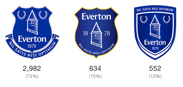
As expected, Crest A, the most traditional of the choices, was overwhelmingly preferred to the other two options, garnering 72% of the 4,168 votes cast.
Everton will unveil the crest that received the most votes in the official Crest Vote on Thursday, 3rd October.
Reader Comments (81)
Note: the following content is not moderated or vetted by the site owners at the time of submission. Comments are the responsibility of the poster. Disclaimer
2 Posted 01/10/2013 at 23:36:53
BK will probably sack Roberto next and start managing the team himself !!
3 Posted 01/10/2013 at 23:29:56
I liked the traditional badge that disappeared 13 yearsago, but if the name Everton and founding date have to be on there A is acceptable for me.
It's a pity we have had to suffer this season's abomination and the Club could maybe have given more choice for the vote, but at least they saw sense over the Beehive crest and tried to put it right.
I would give them 1/10 for the beehive, but 8/10 for the final result which we all know will be A. Whilst 10/10 would have been better, the chances of pleasing everyone, especially the anti-everything brigade were always minuscule.
4 Posted 01/10/2013 at 23:39:20
5 Posted 01/10/2013 at 23:48:14
We are on the cusp of a new era at Everton, I have a feeling that this season will be the start of the revival!
6 Posted 01/10/2013 at 23:57:25
7 Posted 02/10/2013 at 00:19:02
8 Posted 02/10/2013 at 00:32:58
9 Posted 02/10/2013 at 01:01:28
I believe option 'B' would have been the club's choice, given its simplicity and similarity to the current badge.
I do hope that the official poll was fair and that the results are not skewed, as in the questionable result of the Destination Kirkby poll.
10 Posted 02/10/2013 at 01:39:01
11 Posted 02/10/2013 at 01:50:48
12 Posted 02/10/2013 at 06:09:54
13 Posted 02/10/2013 at 07:14:13
If it doesn't get picked there's something dodgy going on.
14 Posted 02/10/2013 at 07:20:50
Of the 3 I voted for A) but in my eyes this was a completely useless exercise in the first place!! and it should have been left alone.
15 Posted 02/10/2013 at 07:40:24
I don't know how many will vote in the official poll but 72% of a 4,168 representative slice of Evertonians says that the new badge cant be anything other than A.
I voted for it, I like it, don't love it, will live with it but personally think its an opportunity missed.
The club could've done something really great here - but then they couldve done something equally awful too (as has been proven).
If it was a game of Blackjack I'd see this as being dealt 18 - and if so I'd "stick". Maybe next time we'll get dealt an Ace and a King.
16 Posted 02/10/2013 at 07:48:26
I believe you've hit the nail on the head. It's gonna be B. Even though nobody voted for it.
I can't see how the fans favourite A is easier to reproduce than the proper one.
It would be a massive blow to fan relations if they do this. Not because choice B is shit but because they will have treated the fanbase like idiots again.
17 Posted 02/10/2013 at 08:18:40
On the shirt C looks quite good.
18 Posted 02/10/2013 at 08:32:19
just for the record I voted for C, because it's new, sharp and different to anything else we've had
19 Posted 02/10/2013 at 09:12:27
20 Posted 02/10/2013 at 09:15:52
21 Posted 02/10/2013 at 09:19:01
Like others have said - I am also beginning to like ASPECTS of the new badge. I like the modern design of it, but if they could've at least added the motto to still tick the history box.
It would have been nice if the motto was added a line at a time in the 'hoops' of the tower (like one of the fan suggested designs, I can't find the link to that article now)
22 Posted 02/10/2013 at 09:30:54
By the time the vote was put on the options that came out, was anybody still bothered?
23 Posted 02/10/2013 at 10:00:15
I voted "A" and I will be a little miffed if 72% is not carried through to the official vote.
Surely it will be "A" - won't it?
24 Posted 02/10/2013 at 10:04:50
This is the very reason why big companies appoint design agencies and they don't (usually) just ask the people that make purchases to "design their brand for them".
We will never compete with the likes of United, Chelsea, Barcelona or Real Madrid if our board doesn't grow a pair of balls, make some courageous decisions and stuck by them.
What an utter farce.
25 Posted 02/10/2013 at 10:53:44
Good little sheep are we...
26 Posted 02/10/2013 at 10:59:07
27 Posted 02/10/2013 at 09:51:03
I was uninspired by the three options, especially after seeing some really interesting efforts from fans, but I accept that everyone has different tastes so it would always be difficult to tick all boxes. When I saw these 3 options I instantly preferred A but then I found myself cherry picking bits I preferred from the other two. This then led to picking bits from other crest designs outside of the 3 vote options.
One thing I am sure about is that IMO the club name (if it must be included in the crest) looks better at the top of the crest, as in option B. I also think it would be better in capitals as it gives it a more symetrical look (but I note that the way it is currently portrayed on all the crests seems to be the existing preferred club branding as it is all over the website).

I just had a quick mess about using Option A as a base (excuse how crude they are but I was not using particularly advanced software and you will note I have no real talent for this type of thing) but I thought at least the start point met much of the club's brief. Whilst the banner under the crest makes many say "it's similar to the old one but not as good", I can see how it is simpler and the motto is more evenly spaced. The club name is included and I have used various different tower designs. The motto is on as is 1878 and the colour pallette is simple.
I guess this is the problem with design by committee, everyone will have a slightly different take and may want to change little things here and there even with a broadly popular design. I hated the current one and I don't hate option A, so if that's the one they pick then I will move on.
COYB
28 Posted 02/10/2013 at 12:13:22
All three of these designs are pretty boring to be honest. I can understand the desire of most fans to retain the traditional badge and something like option A is certainly the best way of doing that - option B looks unbalanced to me and I've never liked the yellow used in the badge either.
I do wish though that a more interesting and radical modern option was presented. As others have said, the fans put forward some interesting ideas doing away with a shield design entirely - using a circle, using large wreaths to frame the tower, or using an ultra-simplified design focused just on the tower. I would have liked to see something like that put up for consideration. Option C is the nearest attempt to do something a bit out of the box, but it's been pretty poorly executed unfortunately - what is the point of that white bit at the bottom of the shield? Strange.
I have to admit that I quite like the simplified approach Liverpool have taken to their crest, focused on the liver bird... it's a shame something similar wasn't put forward here. Though realistically fans would have probably voted for tradition anyway.
29 Posted 02/10/2013 at 12:32:45
Option A contains all the components the fans wanted and is a clean, crisp design, though I still think the club should have stuck to their guns over the scroll which looks a bit too fussy, exactly what they wanted to get away from. Anyway, if A wins the vote I will be happy enough!
30 Posted 02/10/2013 at 12:43:59
31 Posted 02/10/2013 at 13:06:24
My favourite crest from our heritage was from the mid 80s with the tower, wreaths and EFC. Simple, elegant and timeless. Why do we need to spell out our name?
32 Posted 02/10/2013 at 13:16:13
They could've quite easy on the old badge, just done away with the yellow and fitted 1878 and Everton in the shield, job done!
33 Posted 02/10/2013 at 13:14:55
34 Posted 02/10/2013 at 13:20:19
However, whilst we as lifelong supporters may not require such signposting, I can understand the logic of wanting to include the name on the badge for marketing and recognition outside of the loyal fanbase. If we were winning things domestically and in Europe, season in season out, then we may not need to spell it out as success would surely build the brand regardless. Anyway, the club seem to have the inclusion of the full name 'Everton' as a non-negotiable part of the brief, so I have begrudgingly accepted it.
I've seen the league titles/stars idea before on comments but I'm not so sure. History is a wonderful thing and our club certainly has that in abundance, but surely the ultimate aim is to win more titles, so if the dream scenario occurs and we start to challenge for the league again regularly, do we add another star each time we win it? The three stars on Manchester City's badge don't represent league titles as far as I'm aware.
Point is it's all about opinions and I could even take my favourite crest from the multiple fan designs and still mess about with it forever, changing this and changing that. The current crest just left me cold and I'd definitely be happier with Option A above.
35 Posted 02/10/2013 at 13:40:25
I just about trust the club not to do this as it would just be too obvious a con. I guess only Kitbag has really lost out this season with the new badge, as merchandising income is presumably irrelevant to the club given the shite deal they signed with kitbag.
36 Posted 02/10/2013 at 13:48:04
37 Posted 02/10/2013 at 13:56:58
38 Posted 02/10/2013 at 13:51:48
Ironic considering the reinstatement of the motto.
If the Nike kit deal really is the main driver behind these two recent redesigns, I would hope the club does not renew it once expired so that any future rebranding is carried out without the restrictions which have seemingly been placed on them, and which inexplicably don't seem to apply to other clubs. Hopefully then we'll get something of the quality befitting of Everton Football Club.
In the meantime we still have one of the worst crests in the Premiership.
39 Posted 02/10/2013 at 14:21:17
http://www.toffeeweb.com/season/12-13/comment/edblog/24770.html
40 Posted 02/10/2013 at 14:30:51
It's simpler, but it hasn't grabbed me. I tend towards C as it's at least slimmer than A. Probably my favourite was when we were great: mid 80s. Much simpler, and with that - to me - seems more confident of who we are.
41 Posted 02/10/2013 at 14:46:30
42 Posted 02/10/2013 at 15:28:51
Anyone remember this? Can I get Dulux to knock up a few pots?
43 Posted 02/10/2013 at 15:21:51
Christ, I really thought we might have seen the back of this particularly irritating and pointless expression.
Please don't take this the wrong way, but take your 'move on' and shove it RIGHT up your arse.
Move on to WHAT ffs?
If YOU want to move on, fucking well move on.
Seriously, what is it with the (AHEM!) 'move on brigade'.
Instead of starting a thread, or ignoring a thread, they come on to a thread people are (obviously) interested in and plead (affects really whiny irritating voice) "Can we move on".
It's like a spoilt bleedin' kid.
"Don't talk about THAT - talk about stuff I want to talk about"
"And what's that?"
"I don't know, just....not this"
You can move on whenever you like, but when you're trying to drag everyone along with you, you're just begging to be told 'fuck off!'.
Imo.
44 Posted 02/10/2013 at 15:39:22
45 Posted 02/10/2013 at 15:45:36
I understand if someone doesn't find this issue interesting or worthy of debate, but then why click on to a thread about it.
I said in my post that without loving it, if they pick option A then I will "move on" but I still see some merit in have a discussion.
46 Posted 02/10/2013 at 15:47:09
It's like asking the TV to immediately stop showing yet another reality programme that has just started on it, you don't do that, you change the channel.
So Vinny, I'm afraid you should change the article you are reading if you're sick of reading this one.
47 Posted 02/10/2013 at 15:44:17
I'm not sure the club have ever specified an exact CMYK value for Everton blue.
I did a bit of research on this when I was doing my own crest design. According to Wikipedia Royal blue can vary between the shades we associate with Everton and one that is almost navy, hence the colour of the home shirt changes from season to season but presumably still remains within the definition of 'royal blue'.
I can tell you that the gradient shades the club used on the 2000-2013 crest version sure ain't royal!
48 Posted 02/10/2013 at 15:57:53
Exactly. The whole reason for changing the crest was to simplify and make it more transferable between mediums. Option A - just moves back to how it was with a large spend and lots of people's time wasted. Brilliant!
49 Posted 02/10/2013 at 15:58:35
A stirring and succinct post. There's too much embellishment on this site. Finally a man who just says what everyone else is thinking.
Bravo.
50 Posted 02/10/2013 at 16:06:26
Also, Matt, 098, the crest design was nothing to do with kitbag/Nike, but the club. The kit for next season has already been designed - and it is Adidas
51 Posted 02/10/2013 at 16:20:06
52 Posted 02/10/2013 at 16:31:43
Don't mean to nit-pick but according to the club website Nike were involved -
"as well as the Everton fan-base, key commercial partners such as Kitbag and Nike were also consulted and their input and ideas were fed into the design process"
source: http://www.evertonfc.com/crestevolution.
Exactly how much meddling, ahem, input they had seems to be open for speculation.
Good news that the new shirts will be Adidas IMO, much prefer their designs to Nike at the moment.
53 Posted 02/10/2013 at 16:39:43
I wouldn't be surprised if C is unveiled as the winner, we've been guided to our choice remember that, it wasn't a choose your own from many choices and the best one wins.
I can just imagine the club statement: "It was extremely close but C just by a nose .........."
Why the fuck would they need so many days after the poll has closed to process these votes and declare them? This isn't the general election with millions of votes and hundreds of different constituencies to declare.
54 Posted 02/10/2013 at 16:56:22
Anything other than A and it is a nailed-on fix.
55 Posted 02/10/2013 at 17:04:52
56 Posted 02/10/2013 at 17:05:32
BK has some "Outs" with this badge choice, he can point out that most of the people on this forum are here to complain and grumble and went down the traditional route with A.
Whereas the greater and more open minded of the blue horde, have open minds and chose much more freely than us, hence the 'new cleaner easier on the eye' C badge was chosen.
He/they (corporate partners) want a badge that is easily identified by hormonal pubescent American schoolkids, to hell with what we want! We only pay their wages, what do we matter?
57 Posted 02/10/2013 at 17:14:35
58 Posted 02/10/2013 at 17:06:11
Unmoved I think
Now say to yourself 3 times taking a deep breath in between
" I can move on" In 3 Seconds exhale 7 seconds
" I can move on" In 3 Seconds exhale 7 seconds
" I can move on" In 3 Seconds exhale 7 seconds
And relax. There isn't that better.
My work here is done
60 Posted 02/10/2013 at 17:25:09
I don't know but I would guess the former is a for-profit organisation and the latter is a not-for-profit. Billy boy and another "cunning stunt" as they say?
61 Posted 02/10/2013 at 17:35:52
Well if I move on about the whole 'move on' thing then those who feel it ok to tell people to move on, may feel emboldened and continue to tell people to move on so I will continue to tell those who tell people to move on to fuck off.
62 Posted 02/10/2013 at 17:47:06
I'm sure that would be an 'option' for him, but even if we're miserable, glass half-empty complainers (nb: who complain 'for the sake of it') he'd have to be at his most devious to go against 72% out have 4168.
Remember, the 22500 who shamed them into changing the beehive must have (at least on this issue) been thinking along similar lines to many TWers.
63 Posted 02/10/2013 at 18:25:18
The very same 'Electoral Reform Services' were the company that oversaw the Destination Kirkby ballot (http://www.evertonfc.com/news/archive/ballot-result.html)
And I will always refuse to believe that 59% of balloted members said 'Yes' given the strength of opinion that permeated the entire Everton community at that time.
64 Posted 02/10/2013 at 18:39:09
65 Posted 02/10/2013 at 18:55:17
66 Posted 02/10/2013 at 19:04:50
We'd be venting ourselves big time about these badges (and also about DM & BK), but as it is Roberto has given us all hope and we're all in jolly old mood and can't wait for the next game to come.
You've picked the right time to foist this one on us panto Billy!
67 Posted 02/10/2013 at 19:07:15
70 Posted 02/10/2013 at 19:20:27
There's a lot of teams wearing adidas in the Premier League this season and with the exception of Chelsea ( who will get special treatment I'm sure ) it looks like they use an identikit design for most of them. Hull, West Brom and Sunderland all have the same shirt with funny looking blocks on the sleeves, just different colours and Stoke's shirt looks like Sunderland's.
Fulham have a weird looking ' le coq ' type collar, Chelsea have some rather odd socks and West Ham's is very fussy.
Having finally got a decent Nike kit this season, going to adidas will be a shame I think. Back in the day ( 20-30 years ago ) the 3 stripes were cool, but now they have become a bit of a badge for Chavs if truth be told. IMO of course!
74 Posted 02/10/2013 at 20:15:33
75 Posted 02/10/2013 at 20:15:33
76 Posted 02/10/2013 at 20:22:40
77 Posted 02/10/2013 at 20:33:05
Eugene – Well played, pal. I have a massive problem with people telling us to stop moaning. Why take the time to read our moaning to moan about it. Dear oh dear.
79 Posted 02/10/2013 at 20:54:55
Yours sincerely, Kev 'Superfly' Johnson
80 Posted 02/10/2013 at 21:27:15
Dare I say it the shite got it right, keeping the club crest and simplifying the shirt.
81 Posted 02/10/2013 at 22:37:56
82 Posted 02/10/2013 at 23:22:55
The new one looks better and the club should have strapped a pair of bollocks on and kept it.
83 Posted 02/10/2013 at 23:40:02
I agree, too cluttered.
Same with those Canaletto paintings, why so many boats, buildings and people?
Couldn't he have simplified things - why not just one stylized feller, in a gondola by a walI?
(Jesus, the idea that there are Evertonians out there who would keep the Fisher Price beehive depresses the shite out of me)
85 Posted 03/10/2013 at 09:08:26
87 Posted 03/10/2013 at 09:42:49
88 Posted 03/10/2013 at 09:36:01
However, Wikipedia says ER Services is a closely related organisation. So maybe you're right - if it's wrapped up with ER Society it can be trusted.
89 Posted 03/10/2013 at 10:27:38
113 Posted 03/10/2013 at 15:31:59
Jus sayin'
Add Your Comments
In order to post a comment, you need to be logged in as a registered user of the site.
Or Sign up as a ToffeeWeb Member — it's free, takes just a few minutes and will allow you to post your comments on articles and Talking Points submissions across the site.
1 Posted 01/10/2013 at 23:24:31