


Season 2015-16 Opinion Talking Points
I just don't like the redesigned club crest
 53 Comments
Let's face it, the current crest was a botch job after the debacle of that first fateful redesign attempt for the 2013-14 season. Although the dust seems to have well and truly settled on this subject, I am curious what other ToffeeWebbers think about it as it is linked to a lot of other subjects already discussed on this site — the kits, the new stadium, the sponsors, marketing, and so many commercial aspects... Submitting this to you now might also provide a welcome distraction to some of the other chatter during this frustrating off-season time!
The questionnaire Evertonians then completed in response to that outrageous version was pretty appalling and yielded a dismal choice of three designs, from which the current badge was eventually selected just as the best of a bad bunch:
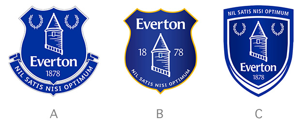
Whoever was responsible has tried to shoehorn every possible aspect in order to tick some marketeer's boxes. All the components everyone wants are there (part of the problem is in trying to please everyone) but it is nowhere near as slick, smart, appealing and stand-out as it aught to be.
I remember being drawn to the badge like a bee to honey in the 80s and 90s, whether it was on a boot bag or a pin badge. My mates and I would draw it on our school books etc but I don't see the same mystique around it today. On the rare occasion you see it in the shops, it looks very underwhelming compared to the those of Milan and Madrid... or even Crystal Palace and Stoke City...
Unfortunately the name and year have been stuffed incongruously inside the shield because of some ridiculous (imo) logic that it must show the name (to have meaning for anyone outside the UK) and the year (because if you know your history). I actually liked the addition of 1878 on the badge in the more recent Premier League years but doesn't it now look a bit tacky in it's current format?
It is also apparent that what we were told then about the difficulties of using more than one or two colours has proven to be a complete fallacy based on what most other clubs are now doing quite successfully — like Man City after their dalliance with an elaborate shield and eagle etc) — look at Chelsea, Newcastle... and so on.

And what about the reworked / simplified scroll and Latin text?? Is it an improvement? Look at the Welsh FA's reworked crest with a scroll and Welsh text — in no fewer than four colours, if you include white!
There are now, sadly, so many better examples of what a 21st century football club crest/badge should be. So, if indeed we are to move to a new super ground and we are developing a commercial nouse to rival other clubs, something must surely be done about the badge.
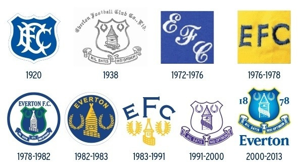
For me, the club crest is a historical emblem and should remain as it has (with perhaps minor modification) since 1938. It should be the traditional crest that appears on matchday blazers (last seen in the FA Cup Final 1995?) and ties etc, and should be prominent in various forms of media and apparel and locations around the ground. However, there is no reason why the badge on the playing shirts cannot be different.
Manchester United are a good example of this and I have to admit to admiring what Liverpool have done recently with their return to a simple liver bird emblem whilst keeping the crest with he Shankly gates etc that was introduced in the 90s... It pains me but their shirt badge is iconic. Notwithstanding the poor NB kit, the badge is simple and elegant and it is viewed with reverence and worn with pride.
The best badges to appear on our kits imo were from the late 80s through to the mid 2000s and there is no real reason why we can't return to something along these lines. Replicating the elegance and simplicity of the late 80s imo would be a real stand-out on the shirts.... a bit like Spurs at the moment...
As a side note, kits by Adidas, Under Armour, Puma and others lead me, sadly, to go as far as to say that Umbro has had its day now, as others have mentioned on different threads.Performance aspects aside, where Umbro were once world leaders in football clothing design and technology, they have become a little uninspiring aesthetically... and without over simplification of the sports psychology there is truth in that adage: "If you look good, you feel good; if you feel good, you play good," etc...
Getting back to the point, however, whether the kit designer or manufacturers are involved in the badge design, I don't know...
So, in summary, although there are undoubtedly bigger fish to fry at the moment, I hope the subject of the badge on the shirt and/or the official club crest will soon be revisited (perhaps including the potential adoption of a blue liver bird to go with the coming season's Dixie) as there is an undoubted impact... We need a symbol of a new era we can all get behind.
 Return to Talking Points index : Add your Comments »
Reader Comments (53)
Note: the following content is not moderated or vetted by the site owners at the time of submission. Comments are the responsibility of the poster. Disclaimer
2 Posted 21/06/2017 at 21:45:26
Also: Stoke City? Stoke? Their badge is just stripes and words (and some numbers if anyone's going to be pedantic); one of the laziest efforts I've ever seen. At least their previous iterations had some Staffordshire-related imagery, namely the knot and a kiln.
3 Posted 21/06/2017 at 21:45:57
4 Posted 21/06/2017 at 22:11:11
5 Posted 21/06/2017 at 22:14:23
However, we went through the process; retaining the old crest was not an option. But getting them to revisit the new one is, I'm afraid, a non-starter. Unless you can mobilze the dreaded force of social media and get them on your side! Call it... Crowd-Cresting!
6 Posted 21/06/2017 at 22:17:46
7 Posted 21/06/2017 at 22:20:19
8 Posted 21/06/2017 at 22:37:45
9 Posted 21/06/2017 at 22:39:09
For me, it should be a simple design, the tower and two wreaths as per the 80's. I wouldn't be bothered about the shield, and I certainly don't need to see the word Everton. I could also do without the motto, as long as we adopt a two badge approach like LIverpool and produce the busier badge on official things, and the minimalist badge for the kit only.
But, I'll be the last in the queue to protest a change of badge again.
10 Posted 21/06/2017 at 22:39:34
11 Posted 21/06/2017 at 22:40:43
[Okay, maybe not an exact quote...]
12 Posted 21/06/2017 at 22:54:47
Didn't he go on to manage a football club or something?
"Badges? We don't need no Stinking badges"... or maybe it was Countryfile: "We don't need no stinking badgers."
13 Posted 21/06/2017 at 23:10:14
14 Posted 21/06/2017 at 23:44:19
My favourite badge was 1991-2000 but the current one I've got used to and like it.
15 Posted 22/06/2017 at 01:14:31
16 Posted 22/06/2017 at 01:28:38
Look how fast it has spiraled off into Eli Wallach and odiferous caniform roadkill.
17 Posted 22/06/2017 at 04:48:55
For me it is case of classicism v's modernism. Historically the medieval crests were a rich display of intricate woven colour, with the workmanship and the colours themselves carrying messages of wealth and prestige. Coloured dyes, especially being rare and expensive, so used in small quantities with the then classical images of power, lions, dragons etc.
Fast forward the fashionable blazer and the breast pocket. Epaulletes and fancy cuffs were always more continental and militaristic, but wearing your badge on your heart and not your sleeve seemed more 'British' I suppose! The solid navy as a backcloth to the colourful, heavily detailed badge became imprinted onto our way of seeing things.
Fast forward again the you come up with the simplified designer statement badge. . . . because it was cheaper.
Fast forward again and the more intricate bade style can be making a come-back as the means of production make it readily affordable.
Graphically I think the badge should be more colourful (but without any red!) and should encapsulate the spirit of the new stadium, in a similar way that the new stadium could catch associated historical references such as Leitch's blue / white diagonals or the old lock-up tower.
We should ask Dan the Man to give us some ideas.
18 Posted 22/06/2017 at 07:08:14
Nothing is sacred now. Change, change, change. It is possible to retain some history and add new elements (crests in this case) for use in other situations/contexts, as opposed to "updating" everything.
Ultimate brand identity and impact is achieved when a simple basic symbol without letters or numerals is instantly perceived, such as the Nike swoosh. Maybe one day, our club might be recognized by just a plain outline of Prince Rupert's tower, in hand with more detailed and traditional branding elsewhere. The tower is the most pertinent component and could be developed to be as potent as the Liver Bird.
19 Posted 22/06/2017 at 07:16:39
I recall a number of TW contributors proposed designs of their own which were superior to the club's offerings.
Thanks for reopening this debate because in my view Everton's current badge is an embarrassment.
20 Posted 22/06/2017 at 07:50:07
I don't mind the new one but I preferred a Chelsea type crest with Everton Football Club and Nil Satis Nisi Optimum around the perimiter separated by 18 78.
Nevermind!
21 Posted 22/06/2017 at 07:51:44
22 Posted 22/06/2017 at 08:02:49
And that Welsh one is awful too! We must be desperate if we have to stoop to discussing the crest!
23 Posted 22/06/2017 at 08:21:34
24 Posted 22/06/2017 at 08:28:43
The crest was always still the shield and the scroll with NSNO on it since it was designed. (If no one believes me, check the programmes from the past!)
25 Posted 22/06/2017 at 09:24:56
26 Posted 22/06/2017 at 09:26:50
30 Posted 22/06/2017 at 11:05:00
31 Posted 22/06/2017 at 11:37:35
I always liked the Bob Latchford badge myself and the retro shirt.
32 Posted 22/06/2017 at 11:52:23
And although iconic, the Milan badge is rubbish. Stoke too, it couldn't be more plain and boring.
As you say, you can't please everyone...
33 Posted 22/06/2017 at 12:21:27
Stoke changed their badge in the 2001-02 season to the simple stripe design claiming the badge that also featured on street signs in the city was too expensive.
The Hasbro inspired badge from 2013-14 was awful but there's nowt wrong with the current design IMO. It looks iconic and Everton.
34 Posted 22/06/2017 at 13:02:21
I'm not too keen on the current design, but it's preferable to that awful effort in 2013-14.
35 Posted 22/06/2017 at 13:12:10
It was curious 'back then', with so much 'smoke and mirrors' going on at the club, how the issue with 'THAT' badge galvanised the wider Everton family so much that the club made a complete climb down on the subject, made grovelling apology and by way of appeasement, offered the open vote on the three options you showed.
As much as others in this thread have ridiculed your post (unfairly, excessively IMO), as you mentioned the badge – associated as it will be with the kits, the new stadium, the sponsors, marketing, etc – is an iconical representation of the club and is something that may well be revisited soon to align with the 'new image' Moshiri possibly wishes to create.
Having originally been taken aback by 'THAT' badge that provoked so much outrage, it kinda grew on me and didn't offend my eye as much as it evidently did others. Was it the best that could have been designed? No. Was it as 'clean' and distinctive as other recently re-worked badges (some of which you mention)? Again, no.
Whilst clearly unpopular, I for one understood the rationale behind what the club were striving to achieve. Unfortunately, the cack-handed way they went about it ensured it was never a 'goer'.
What resulted, as you again correctly note, was a badge 'by committee.' The three options offered were a very poor effort. And the winner, as you say, shoehorns every possible aspect into it in an attempt to appease a wide range of demands and taste.
I agree with you 100% when you say it is "nowhere near as slick, smart, appealing and stand-out as it aught to be." It is far too 'busy' to me. A real schoolboy effort.
I also agree with your suggestion that there can be a separation and distinction made between a traditional crest that appears on apparel, locations etc, whilst having a 'minimalist' badge on the playing shirts. Many clubs already do this as you again correctly mention: Manchester United, Spurs, and (anathema as it may be to some to mention it) Liverpool.
So, from this poster, Ian, well done. A good, valid post and one I agree with.
36 Posted 22/06/2017 at 13:13:29
Are there more important issues? Well, yes there are... But does the team walk .the pitch looking like they represent a stylish, vibrant, forward-thinking Club? Well, no – they don't!
37 Posted 22/06/2017 at 13:20:33
38 Posted 22/06/2017 at 13:28:15
41 Posted 22/06/2017 at 13:49:09
45 Posted 22/06/2017 at 14:28:59
How come the emblem/badge that represents the club you love not be of interest or be of concern to you?
I know that results on the pitch is what it all boils down to, but marketing, merchandise sales all add to income, which in turn add to the coffers of the club and propel us forward (ha). Plus you must want gear that looks good should you buy anything.
My kids wouldn't wear anything to do with Everton when we had THAT badge, outraged that the previous one was a million, sorry, trillion times better if that makes sense?
Glad I didn't live in the era after 1938-1991, no chance of getting a tattoo then I can assure yer. Hopefully we get a redesign soon, a quality one, one that echos the direction the club is moving. The one before this one should be eradicated and showed just how much was wrong with the previous ownership in regards that Everton didn't understand/care about their fans (in that regard).
The only problem with this article is Ian said,
"The questionnaire Evertonians then completed in response to that outrageous version was pretty appalling and yielded a dismal choice of three designs, from which the current badge was eventually selected just as the best of a bad bunch."
Bad bunch? It was worse than that!
ps, The Welsh badge looks the nuts.
pps; Do they still have dragons in Wales?
46 Posted 22/06/2017 at 14:54:09
I would have liked to have seen 9 gold stars in a circle to denote the number of times we've been top division champions. Living in Warwickshire, it would give my 6 year old lad something to point to when all of his Chelsea/Spurs-supporting glory hunter friends say "Everton are rubbish".
Last week he got a talking-to because he didn't want to wear his Everton shirt to after-school football. He won't be doing that again!
47 Posted 22/06/2017 at 14:55:21
"Some ridiculous (imo) logic that it must show the name (to have meaning for anyone outside the UK)."
Believe me, it's not ridiculous at all. I'm from Hungary. People wouldn't have a clue what club that crest represents without the Everton sign. Here, where I live, Everton is considered as a "small club" (which is of course dumb), virtually nobody would recognize our crest, maybe even with just the "EFC" letters on it.
49 Posted 22/06/2017 at 15:24:19
Also, I definitely disagree with a revamp to go along with the move. The last thing we need is a new badge to go with the new stadium. We need consistency with the present and past rather than something new.
50 Posted 22/06/2017 at 15:50:14
From my opinion, the badge should be a gradual change through time, each time, minimal changes but keeping up with the epoch. The travesty badge (Kenwright/Martinez badge) was to much change, the one we have is a step backwards on what we had but not progressive.
The Billy Boy/clown travesty badge is comparable to human feces mixed with sprouts impregnating Pete North and then giving birth to said hybrid that they then realised (once born) had also had an affair with Gandis foot and RTL's porn programmes (early sky channels to the young) i.e. Big bushes, not mechanical, not vegetation I can assure you.
51 Posted 22/06/2017 at 18:32:14
As for the Umbro kits, the recent ones, including the latest, are a lot better than the awful Puma shirts worn in the early 2000s. They are also better than those produced by Le Coq Sportif and Nike.
52 Posted 22/06/2017 at 19:12:57
53 Posted 22/06/2017 at 20:02:18
Have got a retro shirt from the 20s with that 20s badge on – love it.
The 80s ones really were dire though. Prefer the 2000-2013 job myself but just glad that abomination from 2013 never made it out permanently.
54 Posted 22/06/2017 at 20:15:33
On a side note, did you know Harpo's real name was Adolf, no wonder he kept his mouth shut.
55 Posted 22/06/2017 at 22:24:36
56 Posted 23/06/2017 at 20:37:12
I couldn't care less about the badge.
My first Everton shirt, bought in Ethel Austin's, was royal blue with a white crew neck. No sign of a badge. My mam sewed blue stripes on white shorts, pair of socks – job done. I thought I was the bees knees in my Timpson continentals. (Stanley Matthews boots with the toe cap but the ankle bits cut off.)
I know that the club rely on selling shirts year in year out but the money they make compared to the TV is meagre.
Go back to the basics and we can claim to be standing against rip-off exploitation of the fans. (At least in that respect.)
Sell the sponsors and other logos separately maybe.
57 Posted 23/06/2017 at 20:43:38
It never bothered them; if it bothers you, you've too much time on your hands. Get a life, go out and kick a ball.
58 Posted 25/06/2017 at 23:36:23
59 Posted 29/06/2017 at 11:07:33
A sign that our activity in the transfer market is keeping fans happy, to an extent, perhaps?
60 Posted 02/07/2017 at 16:32:18
The crest had always been more or less the same since it's inception in 1938. Since the addition of the 1878 and Everton anyway. Google it!
I really wanted it like this with 18 78 either side on the circle.
Link
61 Posted 23/08/2017 at 17:17:19
62 Posted 23/08/2017 at 17:28:33
Add Your Comments
In order to post a comment, you need to be logged in as a registered user of the site.
Or Sign up as a ToffeeWeb Member — it's free, takes just a few minutes and will allow you to post your comments on articles and Talking Points submissions across the site.
1 Posted 21/06/2017 at 21:31:38
The 2013-14 effort was abysmal and threw the club's heritage, history and tradition out of the window. The consultation exercise showed how important these elements were to fans and the redesigned effort is as close to the classic version as possible with a few tweaks to meet modern design needs. 'Everton' has to be on there to broaden the club's appeal; the date similarly adds pedigree.
I imagine there is very little appetite amongst fans to open this can of worms again. I think we are very fortunate to have the badge we have now when the club (like Arsenal) could have dug its heels in over the abomination we had before. There are much more important issues for the club to focus its energies on now than re-visiting the badge.