


Season › 2014-15 › News
New club crest makes its debut
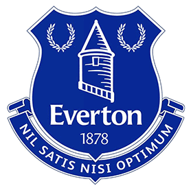
The new crest selected by the fans
For the first time in the Club's history the crest has been selected by Evertonians and it will begin appearing around the stadium this week as the Club makes the official switch.
The crest was following supporter consultation in October 2013, and it received an overwhelming 78 per cent of the online fan vote.
The new crest strongly reflects the Club's heritage and status as an authentic, respected football club.
It brings together the key icons of the Club's tradition - the Tower, Nil Satis Nisi Optimum and the Shield, rendered in the strongly preferred Club colours of royal blue and white.
Reader Comments (39)
Note: the following content is not moderated or vetted by the site owners at the time of submission. Comments are the responsibility of the poster. Disclaimer
2 Posted 04/07/2014 at 19:21:24
3 Posted 04/07/2014 at 19:28:04
About time.
4 Posted 04/07/2014 at 20:04:38
5 Posted 04/07/2014 at 20:50:48
It felt like a new era last season, under Roberto. Now, we're going back to Umbro and this abomination. Two steps back me thinks.
6 Posted 04/07/2014 at 21:45:19
7 Posted 04/07/2014 at 21:53:55
8 Posted 04/07/2014 at 22:00:02
9 Posted 04/07/2014 at 22:00:19
If the problem was with reproduction across the EFC product range, online, etc, they could have sharpened the original design and font without any need for moving bits of it about. Really looks worse every time I look at it. At least if the point was to change the thing then last season's effort actually did that, like it or not.
10 Posted 04/07/2014 at 22:11:47
11 Posted 04/07/2014 at 22:12:45
12 Posted 04/07/2014 at 22:16:01
I have said for ages now that too much has been made of the badge and so far the whole thing has been a sideshow this past few months whilst the transfer business has as per usual taken a back step.
What's more important really, Blues? Are we going to start the new season with Osman on the left and Naismith the lead striker??
13 Posted 04/07/2014 at 22:47:02
14 Posted 04/07/2014 at 23:14:10
15 Posted 04/07/2014 at 23:47:39
Last year Roberto (also many years before that) my no1 choice as manager.
Petition - I've only ever signed or voted for two. First one was to move to Kirkby - what a bad vote.
Second was to get rid of badge. How shit was it - I was outraged... It was unbelievably bad. But almost from the start of the seaso I actually started to like it... By the em I defo liked it. Oh and the new badge thought it was pretty rubbish from the start and now it just outlandishly terrible.
78% ( and more) have messed up – old badge far better. I wonder what percentage will admit their mistake.
16 Posted 04/07/2014 at 23:49:18
Anyway I do like it, its not perfect or so terribly different but it looks good and I always thought the yellow looked generic and dated. It looked too yellow. If that makes sense.
17 Posted 05/07/2014 at 05:57:07
18 Posted 05/07/2014 at 09:45:33
Couldn't care less if its Yellow, Orange or RED; for me it's all about the football.
19 Posted 05/07/2014 at 09:55:48
Then it becomes the single best piece of design I've ever seen.
As for the criticism 'too cluttered', that's what they said about Canaletto (...probably).
21 Posted 05/07/2014 at 10:59:30
"The masters make the rules for the wise men and the fools"
22 Posted 05/07/2014 at 11:18:09
True.
23 Posted 05/07/2014 at 12:13:35
I don't see yellow as one of our heritage colours, it's just a change colour that became tradition.
Black is, however, a heritage colour, and although it wouldn't be useful in this badge, I am certainly glad that it's re-implemented into the kit.
The 2000-2013 badge, though well-designed, had light blue in the gradient, which is not our colour – Royal blue is... and our new badge is exactly that.
24 Posted 05/07/2014 at 12:18:20
25 Posted 05/07/2014 at 14:11:55
Like our blue being Royal Blue, our 'yellow' is actually (or should be) amber.
26 Posted 05/07/2014 at 15:09:57
A few too many chopped nuts on the Classico admittedly....
27 Posted 05/07/2014 at 15:38:59
Last years wasn't as bad as everyone was making out. It looked a lot smarter in a single colour.
Anyway... let's sign some players Billy!
28 Posted 05/07/2014 at 19:12:01
29 Posted 05/07/2014 at 21:33:25
31 Posted 05/07/2014 at 23:08:17
I support the team, not the badge, so give me a team that I can be proud of. Would it matter if Roberto won something this year but the badge was crap?
32 Posted 06/07/2014 at 00:42:40
33 Posted 06/07/2014 at 02:12:07
The sad thing is that the fiasco of the awful badge we had last year inspired many Evertonians to come up with some great designs that could have offered us a real choice of something different, if they really felt it was necessary to change the badge at all. Based on how little the design has changed from the one we were using the season before last, I really can't see what the point of the exercise was.
34 Posted 06/07/2014 at 07:07:19
35 Posted 06/07/2014 at 08:16:41
36 Posted 06/07/2014 at 09:37:17
What are you 7?
You can only deal with one issue at a time?
This is a website that post threads on all sorts of different Everton-related subjects.
The badge is one subject, transfer activity (or lack of it) is another and you can have views and post on BOTH.
As for getting Â’distractedÂ’ about our lack of transfer activity, what EXACTLY are we supposed to do?
Do you think Everton havenÂ’t signed players because TWers took their eye off the ball re the badge?
"Come on, we need to forget the badge and concentrate on a much more important issue... one that we have absolutely no fucking say in whatsoever and canÂ’t influence in any way, shape or form"
You add "I support the team, not the badge."
Again, ludicrously simplistic nonsense, itÂ’s Everton Football Club and like every club, a lot of different individual elements go into making up the whole thing.
Or maybe youÂ’d be happy to see us play bollocko?
"The shirt, shorts and socks donÂ’t matter, I donÂ’t support the shirt, shorts and socks, I support the team" etc blah.
37 Posted 06/07/2014 at 10:16:20
Yes, there were better options, but we were consulted in some way at least. The "funny" thing is that, after several years of flat design, gradients (colour fades from one tone to another) are seemingly back in...
38 Posted 06/07/2014 at 10:37:54
The club will unlikely make any changes to the badge over the next few years because of the (rightful in my opinion) backlash. So we'll be stuck with the fact "ticks all boxes" Milton Keyes version for a while.
39 Posted 06/07/2014 at 22:38:58
40 Posted 06/07/2014 at 21:05:29
Of course the performance on the pitch and the success of Everton is the most important thing. However, that does not mean everything else pales into insignificance. This is a FORUM and we post things that matter to us however trivial they are. We whinge because we care.
If you donÂ’t like whinging, why read the posts and then whinge about whinging? Hang on, I am now whinging about people whinging about whinging.. I hope you get my point.
41 Posted 10/07/2014 at 09:05:44
Much better than last year's 'Fat Rascal' but could have been better still.
Add Your Comments
In order to post a comment, you need to be logged in as a registered user of the site.
Or Sign up as a ToffeeWeb Member — it's free, takes just a few minutes and will allow you to post your comments on articles and Talking Points submissions across the site.
1 Posted 04/07/2014 at 18:52:43
Better than the foregoing abomination, though, that's for sure!