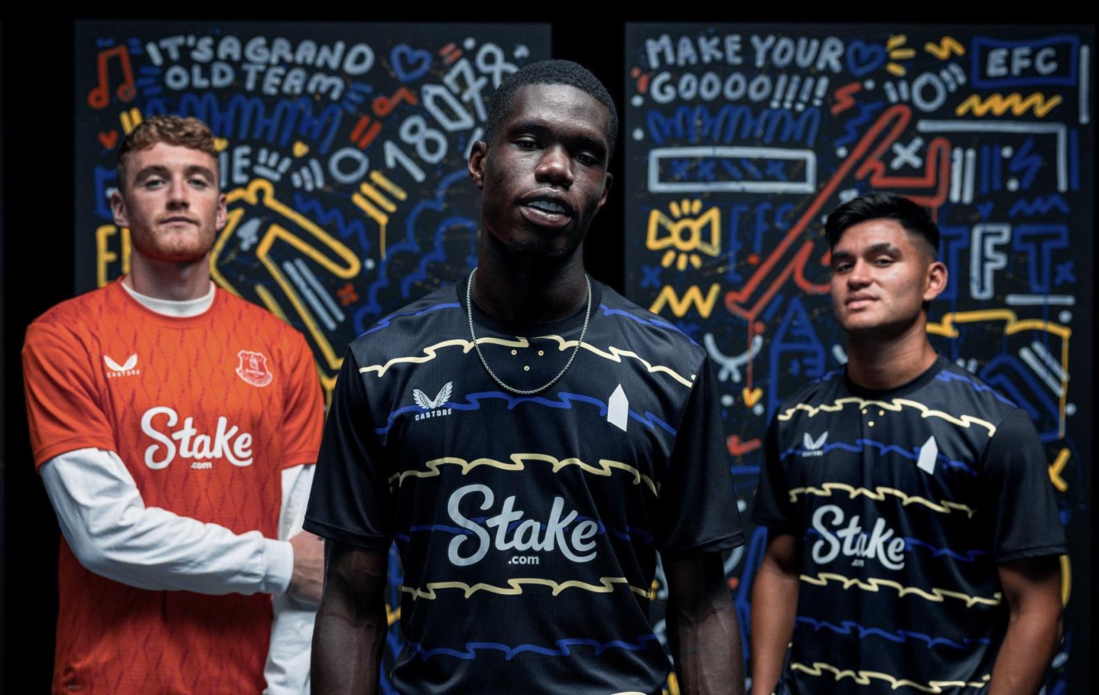
Everton have released their third kit for the 2025/26 with the River Mersey serving as design inspiration.
In partnership with Castore, the jersey, much like their home and away shirts, pays homage to the team’s new waterfront stadium at Bramley-Moore Dock.
“The black shirt, featuring a crew neck collar and Prince Rupert’s Tower icon on the chest, incorporates an abstract blue and yellow pattern that repeats through the body and mimics the flow of the river past Everton’s new stadium, which was opened with a 2-0 victory over Brighton & Hove Albion on Sunday,” said the club website.
“The 2025/26 third shirt, available in short sleeve only, is complemented by black shorts that feature a blue and yellow trim, a flat finish waistband, concealed draw cords and the tower icon on the right thigh.
“Black socks with blue and yellow stripes on the fold-over mirror the colour scheme, while the tower icon on the shin and trademark Castore wings on the calf complete the look.
The striking visual motif on the front of the shirt is influenced by the work of local graphic artist Neil Keating. Keating’s street art described as “colourful, emotionally resonant and culturally grounded” can be found around the city of Liverpool.
The artist also makes a cameo in the jersey announcement video along with summer signings Jack Grealish, Kiernan Dewsbury-Hall, Charly Alcaraz, Thierno Barry, and Mark Travers, among others.
Reader Comments (42)
Note: the following content is not moderated or vetted by the site owners at the time of submission. Comments are the responsibility of the poster. Disclaimer ()
2 Posted 27/08/2025 at 10:08:38
3 Posted 27/08/2025 at 10:09:51
I don't mind the design and think it better than the pale yellow effort, with a crew neck and a collar.
The price is a complete rip-off!
4 Posted 27/08/2025 at 10:27:25
Commercially, this will sink lower than whale shit. TFG will have these Wirral cowboys out soon, to be replaced by a decent American supplier that the Everton fans can wear without the fear of ridicule.
5 Posted 27/08/2025 at 10:36:13
6 Posted 27/08/2025 at 10:39:00
Okay, I get that sometimes when playing a team with a similar colour (home) strip, there is need for one possible change. Quite often when we play a team in red or red and black, there is no clash at all, yet the away strip is worn instead of the traditional one?
I always think of the poor Dad who has match-going and supporting kids. "Dad, I want all the strips!" (Times three). No wonder he is poor!
7 Posted 27/08/2025 at 10:42:42
Weirdly they seem to nail them every season.
8 Posted 27/08/2025 at 11:15:20
9 Posted 27/08/2025 at 11:21:22
…would never wear it myself!
10 Posted 27/08/2025 at 11:53:06
11 Posted 27/08/2025 at 12:32:14
12 Posted 27/08/2025 at 12:48:44
Reading this it looks like this 3rd kit has been designed by the American owners. What is more they want to do something radical with next year's home kit!
13 Posted 27/08/2025 at 12:53:02
These kits are made for the younger fans. It's really good and fashionable. Just go buy one and stop bellyaching.
14 Posted 27/08/2025 at 13:32:57
Stuffy old Everton needs binning off and this is part of that. Well done, Everton.
(I still won't buy one!)
15 Posted 27/08/2025 at 13:46:48
16 Posted 27/08/2025 at 13:50:46
The home one has grown on me but I can't justify the £80. I usually do buy the home shirt.
17 Posted 27/08/2025 at 13:53:02
18 Posted 27/08/2025 at 15:52:35
19 Posted 27/08/2025 at 16:09:21
Looks like its been drawn on with crayons!
20 Posted 27/08/2025 at 17:43:15
Should have left that one out or run it along the shoulder and neck, makes it too noisy on the eye.
21 Posted 27/08/2025 at 17:55:04
My only issue with kits is they release far too many of them. Other than that, fine. Horses for courses. No one forces you to buy one.
Also, people moaning about the badge. The use of the single St Rupert’s Tower badge as an alternative to the traditional one is not Castore’s doing. It’s clearly a club decision and is all over the stadium, and the last few away shirts. And it’s on Everton Way! Everton have changed their badge loads of times over their history. It’s not sacrosanct.
22 Posted 27/08/2025 at 18:19:20
23 Posted 27/08/2025 at 18:21:00
24 Posted 27/08/2025 at 18:42:57
The simplified badge suits the overall look and could be worn as a simple leisure top.
25 Posted 27/08/2025 at 20:21:31
It’s hideous and unlikely to be sold much or worn even by kids.
Let’s hope there’s not too many games where the team has to turn out in that kit.
26 Posted 28/08/2025 at 01:07:18
27 Posted 28/08/2025 at 01:31:51
28 Posted 28/08/2025 at 02:44:31
Was in a shop the other day that had the home and second kit for £8 but not in my size.
Will have to go back next week to see if they have this one in.
Don't like the tower logo though, looks like they're trying to dumb things down like they did with the Mickey Mouse Clubhouse badge that time. But that one looked a lot better than this.
29 Posted 28/08/2025 at 03:36:14
30 Posted 28/08/2025 at 04:47:14
31 Posted 28/08/2025 at 21:02:39
I assume you could have similar with this top, but frankly, I still think it would be shit!!
Bobby Mallon (13), correct; I'm over 50. If they wanted a fashionable top for the "younger fans", why didn't they just fetch it out as a polo shirt, and not subject the players to this? Thank fuck I sold my Tardis the other week, I would hate to go back and buy this thinking it was trendy!!
32 Posted 28/08/2025 at 21:19:05
33 Posted 28/08/2025 at 22:01:25
Numerous complaints in the comments about Castore designing such an awful shirt. When in fact it was designed by Neil Keating, an artist and designer from Liverpool. A local. The club promoting a local artist on their shirts. A good thing, no?
Let's just have the same old boring shirts year in year out and keep living in the past, yeah? No.
We've got a brand new stadium and a brand new culture sweeping through the club so people need to get on board and get behind it.
If you want a successful football club it has to change from the bottom up. And that means us, the fans, we're the bottom and we need to move on, drop the past and create a new and vibrant future - just like our new, vibrant stadium these are new and vibrant designs.
Let go of the past, look forward for once. Don't fear change. Be the cultural change. It's the only way we'll ever let go of the shackles of our 'istory and become something new.
I for one, and I often feel like I stand alone in this view, but I for one embrace change and welcome a new era and a new Everton.
34 Posted 29/08/2025 at 02:03:15
35 Posted 29/08/2025 at 10:21:55
You've conveniently entirely missed my point, but well done for trying to have some positive input.
36 Posted 29/08/2025 at 15:05:17
37 Posted 29/08/2025 at 15:07:47
38 Posted 29/08/2025 at 15:11:10
39 Posted 29/08/2025 at 15:58:48
40 Posted 29/08/2025 at 17:12:55
41 Posted 30/08/2025 at 03:15:44
42 Posted 30/08/2025 at 06:39:20
I'm afraid that's pretty accurate.
The home kit has been ranked #3, and the #1 best home kit in the league, since it was presented.
Add Your Comments
In order to post a comment, you need to be logged in as a registered user of the site.
Or Sign up as a ToffeeWeb Member — it's free, takes just a few minutes and will allow you to post your comments on articles and Talking Points submissions across the site.
How to get rid of these ads and support TW
-sm.jpg)
-sm.jpg)

-sm.jpg)


1 Posted 27/08/2025 at 10:00:24